


.jpg)


.JPG)


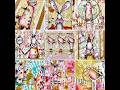
 Here is the book from the top.
 This is what it looks like slightly opened.
 For the outside front and back covers, I painted card stock with Twinkling H20s and mounted it on thin cardboard. For the front, I painted slide mounts with copper and gold rub-n-buff and stamped four identical women using lime green ink. Since I scanned these, you can click on them for a better view.
 The inside front page has the recipient's name, which I erased in the scan to preserve privacy.
 Although this page doesn't look all that great in the scan, it is one of my favorites. It is actually left over from the previous book, where I painted the "H" and dabbed on leftover paint. I was so happy with the results, I couldn't part with it. For the men, I made mirror images and spaced them on my layout, then printed them on the slick side of a transparency. The images became, in effect, rub-ons. I added three brown and white buttons to the right side. The "H" word is "Harmony."
 I decided I had learned a valuable lesson when making the last apron, but apparently I didn't learn enough. While the pins were still intact, the band slipped and one of the pleats came out. I really don't sew anything that resembles clothing!! The background is Twinkling H20s.
 It's hard to see the peppers in this spread because they are very dimensional. They are cut and shaped from thin aluminum, then painted copper. Red wire completes the element. Since my friend loves sheet music, I tried to use it in as many spreads as possible in her book.
 My friend is very close to her father, so for the second "P" I was very lucky to find this image with the word "Papa" in it. I began with more sheet music, then added the image, which I sewed to some sheer fabric. Next I added a pressed Rose of Sharon flower and greens from my garden. I added the sentiment "Papa's little girl" although it's partly hidden by the fabric.
 I hate to admit this is my very favorite card to spread paint and glue. It's far sturdier than anything else I have (which made it difficult to cut) because it's a hotel key card. But my friend absolutely loves NASCAR, so when I saw the NASCAR name on the key card, I knew I had to use it. I used some red card stock, which I dry brushed yellow except for the circle, which I left to stamp the yellow car. I sure hope there's a yellow car on the NASCAR circuit. More vintage sheet music completes the word.
 This is the filler page. I collaged everything I had on the table, then found an image that I hoped would go with the rest of the collage. Before adding the image, I brushed everything with a beige glaze. Once the image was on, I stamped a swirly sentiment along her leg and buttocks, then outlined her in white oil pastel.
 I borrowed this bird stencil from my friend Dana. I first painted the page in yellow Radiant Rain, a product I hadn't used for awhile. I used Twinkling H20 in pink over the stencil. It shows up much better in person. Finally I added the ribbon which I stamped the "B" word on.
 Why is it that yellow polymer clay doesn't look yellow when scanned? I assure you the word and stars are yellow as can be seen in the photos I took when I made them. The image is a blender pen transfer from a photocopy. I then painted the page using fluid acrylics.
 Another one of my favorite pages, this had serendipity written all over it. Since I made the pages individually, I didn't realize the tea bag on the back and the flower would be back to back. I was simply tickled when I glued the two together and they fit so well. The "R" stands for "reach," which I thought this gal was doing. A rubber stamped image and definition, silk flower held with a jeweled brad, and the brass R complete the spread.
 This was supposed to be a new technique I read about, but I don't think I got it right. The idea is to use a dark pen on light areas of a photo and a light pen on dark areas. If done correctly, the background melts away and you have an image that you don't have to cut away from the background. I think my doodles were too large for the effect, but I had fun playing with it anyway. I used the only two pens I had that would work on the slick photo/postcard. I added a tea bag container to the top
 and added a tag on which I wrote "birthday wishes." I used a tiny piece of UHU Tac to hold the flap in place.
 I love the silver HVAC tape and used it as the background for this piece. In the square is more sheet music I painted with fluid acrylics. I used the same fluid acrylics on the tape. I used an awl to make the holes around the outside and inside of the tape. I added a heart made of paper and fabric, a piece of mesh, and four eyelets to hold it in place. I used the blue eyelets to coordinate with the heart which I used to tone down the background that I thought was too bright for the piece.
 I was running out of ideas for words, so duplicated the "D" declaration spread that I made for the other book. For this one, I used the dark scrapbook paper on the top and vintage sheet music on the bottom so the tags would show better and because my friend likes sheet music so much. The tags read "It's your day."
 I am NOT at all fond of Tim Holtz products. I have trouble with his dabbers, I have trouble with his colors, and now I have trouble with his crackle paint. I nearly didn't use this spread, but I had it finished and really wanted to use it. The crackle paint doesn't crackle, it curls the page and shrinks it. It was thick as rubber cement, even though I opened it for the first time for this project. To top things off, I used nearly half the bottle on this page and didn't cover the entire page. If I were a Tim Holtz reviewer, I would give this product a big, big, big thumbs down. The "A" is for Avril or April. I used it because April is my birthday month and I was trying to tie the two dates together. Since the sentiment was in French, I added a small silver Eiffel Tower to the spread.
 The final Y was also the final page I made in the book. I used fluid acrylics for the background, then cut a painted horse from a card. I had already cut the "Y" then covered it with vintage sheet music which I swiped with more fluid acrylics. The Y stands for yearling, as can be seen in the dictionary definition.
 Here is the key (metal) to the puzzle, along with a silver party hat.
 The back side is filled with vintage hearts and a cameo. The bottom heart on the right is not crooked. It was not dry or set (I used E6000) when I scanned the page. I was able to reposition it before it set completely.
The plastic slide mounts have black and gold rub-n-buff. I actually like the looks of these better than the front.
 Here is a photo of the front and back covers after the book was assembled. I could barely wait for my friend to receive it. It was very personal to make, and she sent an e-mail detailing all the personal touches I tried to use (and hoped she would notice) to make it special for her. I will save that e-mail forever. It totally makes three weeks of working on this book worth every second!!


3 thoughtful remarks:
This is stunning! What a lovely and thoughtful gift and it looks like it was a lot of fun to create.
xoxo
absolutely wonderful book! lucky birthday girl!!
WOW that is one lovely gift!!!
Post a Comment