


.jpg)


.JPG)


Color and the color wheel
Now that you've played with glue and gesso, and learned about design principles, it's time to get colorful. Today we will learn about the complex subject of color, our final design element. Color may be the most important part of composition and the most important and misunderstood design element.
Yes, I'm still offline (although I checked in for a few hours this evening and took time to hook up with Creative Every Day) still doing some much needed deep cleaning of my house, yard, and garden. I've taken a few hours out to work on this lesson, but I can't believe how dirty I've allowed my house to get over these past few months. After all, I have 7 rooms on the main floor, four in the basement, and my office, which consumes the entire second floor. I also have a yard that needed edging, mowing, and trimming. And trust me, although I'm a neat freak, everything at my house needs a good spring cleaning, dusting, and sprucing up. In addition to that, I wasn't exactly as prepared for this week's lesson as I had hoped. So now that I've whined when I should be admitting how happy I am you even bothered to stop by, let's get started, shall we?
COLOR. Color comes from light. If it weren’t for light we would have no color. Light rays move in a straight path from a light source. Shining a light into a prism will create a rainbow of colors because it separates all those colors of the spectrum. When the light rays hits an object our eyes responds to the light that is bounced back and we see that color. For example a red ball reflects all the red light rays. As altered artists we often use liquid paints or patterned paper to create color.
The word color is the general term which applies to all colors, regardless of where they lie on the color spectrum. All colors are mixed from the three primary colors: red, blue, and yellow. Color actually refers to specific hues made from the primary colors, therefore hue is the correct word to use to refer to the color spectrum.Yes, I'm still offline (although I checked in for a few hours this evening and took time to hook up with Creative Every Day) still doing some much needed deep cleaning of my house, yard, and garden. I've taken a few hours out to work on this lesson, but I can't believe how dirty I've allowed my house to get over these past few months. After all, I have 7 rooms on the main floor, four in the basement, and my office, which consumes the entire second floor. I also have a yard that needed edging, mowing, and trimming. And trust me, although I'm a neat freak, everything at my house needs a good spring cleaning, dusting, and sprucing up. In addition to that, I wasn't exactly as prepared for this week's lesson as I had hoped. So now that I've whined when I should be admitting how happy I am you even bothered to stop by, let's get started, shall we?
COLOR. Color comes from light. If it weren’t for light we would have no color. Light rays move in a straight path from a light source. Shining a light into a prism will create a rainbow of colors because it separates all those colors of the spectrum. When the light rays hits an object our eyes responds to the light that is bounced back and we see that color. For example a red ball reflects all the red light rays. As altered artists we often use liquid paints or patterned paper to create color.
Each and every color, or hue, has three properties: chroma, also known as saturation or purity; intensity, which is the brightness or dullness of the hue; and value, or the amount of light and dark in the hue. Black and/or white can be added to produce tints through the addition of white, shades through the addition of black, and tones through the addition of gray.
 The color wheel is a way of showing what is referred to as the "chromatic scale" in a circle using all the colors
 made from the three primary colors highlighted here on the color wheel. Primary colors are those that cannot be created by mixing other colors. Theoretically all hues can be mixed from these three basic primary hues. The three colors shown above are the only "true" colors. I want to thank WORQX for their series on color and these images I got from their site.
 Secondary colors are those you get when you mix two of the primary colors. Ironically, these are found half way between the primary colors. That means green is made from equal parts yellow and blue, while orange is made from yellow and red, and purple is made from red and blue.
 Tertiary colors are made from mixing the primary and secondary hues. Again, look at the color wheel and you will see that these fall between the primary and secondary colors, which are now faded into the background of the wheel. Is this starting to make sense?
 Most of us have heard the term "complimentary colors." These are colors exactly opposite each other on the color wheel. It doesn't matter where the color lies on the scale, the exact opposite will be its compliment. Add the two colors together and you get a muddy brown. That's why some painters call red and green "Christmas brown" when they are mixed together.
 Analogous colors are those next to each other on the color wheel, while
 monochromatic colors are shades or tints of the same hue.
 When not being displayed as a color wheel, the colors are depicted on a color triangle. Based on 19th century theories, the painter's color triangle consists of the primary hues red, blue, and yellow. If you are a painter, artist, or scrapbooker, this is the system you are most likely familiar with.
 The printers' color triangle is the set of colors used as the basis for color printing. The primary colors are magenta, cyan, and yellow. This is also the system your computer screen uses to show the images I have created or copied. Out of the millions of colors your monitor is capable of displaying there are only 216 colors that can be displayed correctly on all platforms by all browsers. Because different operating systems use different systems, you often see the caveat about "not all monitors will display products/images equally."
(All above color wheel images courtesy of http://www.worqx.com/)
Review:
The best review I can give you is to visit the following web sites:
http://www.colormatters.com/color-and-design/basic-color-theory
This site has a great color wheel along with explanations of primary, secondary, tertiary colors, color theory, saturation, and hue.
http://en.wikipedia.org/wiki/Color_wheel
Wikipedia has an excellent article on the color wheel.
http://en.wikipedia.org/wiki/Color_theory
And here is one from Wikipedia on color theory that explains about additive and subtractive colors, a subject I decided to not pursue, as well as warm and cool colors, which I will touch on when we discuss paint.
If I haven't left anyone in the dust (hopefully this gets easier as we progress through the lessons), and you are now becoming familiar with the color wheel, let's go on to paint.
Paint
I'm not sure anyone remembers that I said if you don't own any paint, don't go out and buy any until we discuss color. Well, that time has now come, and we will delve into buying paint shortly.
I suspect most of you own paint in some form. There are four types of paint: acrylics, oils, watercolors, and tempera. Of course, there are variations of these, including mica based watercolors, and other products I'm probably not even aware of. We will primarily work with acrylics, but if you have oil paint, watercolors, or tempera, don’t be afraid to experiment. I don’t recommend oils for ABs due to their long drying time and the fact that oil painted pages could easily stick together if not properly dealt with.
Paint and other coloring media (why don’t more artists use the word media for the plural of medium?) are your best friends when creating AB pages. Paint can be used to make backgrounds, embellishments, or to mask words on your AB page(s). You can use paint to blend a photo or image into your spread, or draw images directly on your book page. Paint can be used with masks and stencils. Paint can also be used to decorate your book covers.
From the Golden web site, I learned that all paint has three components: pigment (which supplies the color), a vehicle (which brings paint to the surface), and a binder (which acts as the glue that holds everything together).
If you have no paint and want to buy some, I suggest the primary and secondary colors from the color wheel. Here is an explanation of the main colors you might wish to buy and the characteristics of each. In addition to the colors listed below, I suggest buying at least one metallic color.
If you have no paint and want to buy some, I suggest the primary and secondary colors from the color wheel. Here is an explanation of the main colors you might wish to buy and the characteristics of each. In addition to the colors listed below, I suggest buying at least one metallic color.
The following information is cited in full from "Blue and Yellow Don't Make Green" by Michael Wilcox, whose emotional aspect of color theory I found appealing from a psychological (albeit non-artist) perspective.
However, if these descriptors seem a bit esoteric, from the Golden web site, I found what Golden calls the "Modern Theory Color Mixing Set," which includes just seven colors plus Titanium White. According to Golden's website:Warm ColorsRed, yellow, and orange make up the warm side of the color palette. These colors have a warming nature and suggest feelings of energy and chaos. In design, warm colors bring the object forward.
Red:Due to its connection to life-forces such as blood and fire, red can evoke the strongest emotions. Red can raise blood pressure and increase eye-blinking. It attracts more attention than other colors because it has the strongest light wavelength. Because of its blood and fire association, dynamic red evokes feelings of passion, love, courage and power. Red is daring, intense and never subtle.
Orange:This color symbolizes the radiant glow of the sun and hints at citrus, with its tangy, juicy flavor. In orange, the passion of red is tempered with the sunny disposition of yellow, to produce a color that is bold, vibrant and energetic. Its warmth evokes spicy, tropical sensations and a gregarious and fun-loving attitude. The exuberant personality of orange is usually considered cheerful and positive, as it is born from the radiance of the eternal sun.
Yellow:Also associated with the golden light of the sun, yellow has a more purely optimistic and happy disposition than orange. As the sun will rise each day, yellow has come to symbolize hope in many cultures. Yellow ribbons worn on lapels or tied around trees in support of troops abroad are a contemporary example. In other cultures, yellow’’s ties to the glorious sun and precious gold have resulted in feelings of royalty and nobility. Overall, yellow is felt to be cheerful, buoyant and outgoing.
Cool colorsGreen, blue and purple make up the cool side of the color palette. These colors have a cooling nature and suggest feelings of peace and restfulness. In design, cool colors recede away from the viewer.
Green:More prevalent on our planet than any other color, green is abundant in nature. Due to its association with plant life, green connotes renewal, freshness and fertility. While shades of green make up the largest discernible color family we can see, it is also the most restful color to the human eye and can slow pulse rate. With a positive association across all cultures, green symbolizes growth, harmony, balance and prosperity.
Blue:Second only to green, blue is overwhelmingly present in our lives. From the endless expanse of the sky to the constancy of water in lakes and oceans, blue surrounds us. Blue’s ties to the sky denote a sense of serenity and spirituality. Blue’s water connection evokes feelings of refreshment, cleansing and coolness. While it can also be introspective and melancholy, as in "having the blues," in general blue is considered loyal and trustworthy, thus the saying "true blue." Blue is tranquil, ethereal, and refreshing.
Purple:Talking of purple, Claude Monet said, "I have finally discovered the color of the atmosphere." Like the atmosphere, ambiguous purple produces feelings of mystery, magic, contemplation, and enchantment. The opulence of amethyst and the rarity of purple dye in ancient times have created purple’’s association with royalty, wealth, refinement and splendor. The combination of the passion of red with the serenity of blue results in the most complex of colors, and one that elicits the strongest emotional response in the cool color set. Purple is endowed with mystical, regal, and intriguing qualities.
Others
Neutrals:Although neutrals can be defined as lacking in color, they nonetheless have integral color associations of their own. Use versatile neutrals by themselves, with each other or with any color in the spectrum.
Brown:Often called the humblest color, brown derives from the soil. Drawn from the very substance of our world, this unpretentious color can be described as nurturing, wholesome, hard-working and practical. It can range from the slightly bland and utilitarian side of beige to rich and hearty chocolate shades. Brown’’s steady comfort is associated with hearth and home.
White:Considered delicate and pristine, white shows itself in nature in the form of clouds and snow. White can symbolize innocence, purity, and holiness. Because of these traits, both brides and medical personnel traditionally wear white. More than any other color, white is clean and pure.
Gray:Subtle and slightly mysterious, gray is associated in nature with twilight, moonbeams, and fog. Conjuring feelings ranging from drab to serene, even in the form of silver, gray is never gaudy. The coolest of the neutrals, gray is a subdued color that evokes quiet and introspection.Drawn from the dark of night, black can be both practical and dramatic. Although it raises ambivalent feelings, since one person might see it as foreboding and solemn while to another it is elegant and mysterious, black is undeniably powerful, formal and sleek. A dynamic partner to the spectrum colors, black has deep and sophisticated overtones.
Black:
And who am I to doubt Golden, since they have spent their lives working on making these colors and mixing them for our pleasure, enjoyment, and use! However, I still suggest buying at least ONE metallic!Not only does this allow the artist to produce the widest color range with the fewest number of colors, it also provides mixtures of remarkably clean, intense color blends that retain their brilliance even in the thinnest wash or glaze. For this set we chose only organic colors (plus Titanium White), providing a warm and cool selection of pigments for each hue space other than green
- Hansa Yellow Light
The cool yellow- Hansa Yellow Medium
The warm yellow- Naphthol Red Light
The bright, warm red- Quinacridone Magenta
The cool red for pinks and violets- Anthraquinone Blue
The warm blue- Phthalo Blue (Green Shade)
The cool blue- Phthalo Green (Blue Shade)
The cool green- Titanium White
The tinter
Of course, you do NOT need to buy the very expensive Golden products when you are just starting to buy paint. For example, 4 ozs. of Hansa Yellow Light (the first color on the above list) in Fluid Acrylic retails for over $15.00. You can buy a LOT of acrylic craft paint for that price. Most acrylic paint sold at your hobby craft stores (such as Michael's, JoAnn's, and Hobby Lobby in the US) can be purchased for less than $1.00 a bottle, and many times at half that cost. Unless you make your living selling your art (which means you would not be buying paint for the first time, anyway), cheaper is often better when it comes to paint in altered books.
They (whoever they are) say an author should know his/her audience and write for that audience. Well, it is my belief that many of you taking this class are scrapbookers and card makers, and as such, have little interest in acrylic paint. I suspect your preferred media are dye, pigment, and solvent based inks and reinkers. However, I hope you are willing to step outside your box, your very comfortable scrapbook paper and ink box, and invest in a few small bottles of craft paint. We are going to be making several projects in the next few weeks that will require handmade or hand painted backgrounds. If you have no paint, you won't be able to play!
Of course, if this were a class of first time ABers who were not familiar with scrapbooks, rubber stamping, and handmade cards, I would first suggest using paint on your pages, then quickly add that paint is not the only way to add color to your ABs, but it is probably the most popular and frequently used way. Other ways to add color include watercolors, colored pencils, crayons, chalk, oil pastels, watercolor crayons, water based pens, glazes, gouache, magazine images, and stencil pastes to name a few. Of course, I suspect most of these painting/coloring techniques are familiar to you.
Review:
Color is a complicated and complex subject, but an important one to master.
The color wheel will guide you through colors that go together and why.
Red acrylics comes in warm hues and cool hues. You should have one of each.
If you have no paint and need to buy some, stick with the primary and secondary colors, black, white, and one metallic.
Metallic acrylics can be used as an accent.
As you can see, I've concentrated on cheap acrylic paint. We will also be using magazine images. You don't need expensive tube or jar paint (if you have it), just use craft paint for these pages.
ASSIGNMENT:
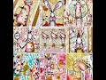
It's important to understand the color wheel, so for this lesson, I'm asking you to create a color wheel like those shown at the above sites or in this blog post using MAGAZINE images, junk mail, or scraps. You may accent or separate the pie wedges with paint, chalk, or pastels, but you must use magazine, paint chip, or book images for the actual 12-color color wheel. Please DO NOT use your scrapbook paper. This will help you learn to "read" colors.
It's important to understand the color wheel, so for this lesson, I'm asking you to create a color wheel like those shown at the above sites or in this blog post using MAGAZINE images, junk mail, or scraps. You may accent or separate the pie wedges with paint, chalk, or pastels, but you must use magazine, paint chip, or book images for the actual 12-color color wheel. Please DO NOT use your scrapbook paper. This will help you learn to "read" colors.
Making your color wheel:
There are several ways to design a color wheel. This is how I did it the first time I made one.
 For this way, draw a circle on one of your extra pages you have removed from your book. Use a plate or something that is about the same size as the page for your template.
 Cut the circle out and fold it half, half again, then in thirds to get the 12 pie wedges. Use this circle as your base and create your color wheel outside your book, then add it, incorporating your theme in some way.
 This is how I interpreted the first color wheel I made. This was for my Hands AB.
 The second time I made this color wheel, was for my Rocking Horse AB. I began with a circle and cut a wedge using geometry.
 The big problem here was my geometry was off and I have lots of gaps and mismatched areas in the color wheel. I also had problems because the book I'm using for the Rocking Horses AB isn't big enough to create a decent wheel AND decorate around it. So I have to admit this is a failure. See, even the teacher can create bad pieces. The main idea is to get the colors right so they can represent a color wheel.
 I copied and printed a template for making my own color wheel from the Interweave (Quilting Arts) web site. Unfortunately, I have not had time to turn this into a color wheel, but I actually saw the possibility of houses in this one. Hopefully by next Sunday night I'll have it finished.
 I'm not sure how well this template will enlarge from my blog, but you can always go to QuiltingArtsTV.com (at least I think that's the address) and get your own copy of the template. I suspect it is much easier than the circles I created.
Playing with color:
There are a lot of ways to play with color. I hope to show a few next Sunday when I hope to have my "homework" finished. Right now, I will show a technique that may be new to you. It's really quite easy and can be used as a background in a future lesson.
 For this page, we will be doing a bit of sgraffito. Sgraffito is a technique where a top layer of color is scratched to reveal a color beneath. The term comes from the Italian word sgraffire meaning (literally) "to scratch." I have a plastic fork all ready to scratch into these pages, but feel free to use a scratching tool of your choice. Begin by painting a page one color and allow that color to dry. Then paint a second color, and do not allow this to dry.
 Scratch into the wet paint to reveal the dried paint underneath. Draw doodles, words, or whatever. Just play. I had to wipe the fork tines several times when the paint built up. This is known as "wet sgraffito."
"Dry sgraffito" is scratched onto your page after the second color of paint has dried. Just like it sounds, you allow the paint to dry, then scratch onto the dried paint/page. This is not recommended for altered books, because the paper can tear so easily, but the technique can be used quite successfully on canvases and wood.
Review:
There are lots of ways to play with color, and I have shown one way. Color is so much fun and can be the basis for all your AB layouts.
For this lesson, I have concentrated on paint, because it is the most used background in altered books. However, there are other types of color you can use, such as dye, pigment, or solvent ink/inkpads, watercolors, or gouache.
Assignment (totally optional as always):
Design your color wheel using paint chips, junk mail, or magazine images.
Create at least two backgrounds using color. Choose from the color classifications we learned, such as complimentary, analogous, monochromatic, or even primary.
Try your hand at sgraffito and see if you enjoy the process.
Supplies you will need for Lesson 9:
Have you noticed there is no more theory? We will now be putting all that information we just learned over the past 8 weeks to good use.
Since we will be making our own backgrounds next time, I suggest you have a supply of paint and ink (or reinkers) on hand. You may also want to bring out your glazes, watercolors, colored pencils, oil pastels, etc. But PLEASE, leave those scrapbook and card making papers in the drawer. This will be a time to experiment.
You will also need your book and you may use a few of those pages you removed from your book, too.
Now it’s time to show us your interpretation of Lesson 7, where you played with Elements of Design. Please remember to show your homework assignment when I ask for it. You have two weeks to post Lesson 7's assignment, but I suspect many of you are ready. And please be sure the link is to the specific post or posts, not to your blog in general.
You may also post ANY previous assignments here. If you are showing any assignment prior to Lesson 7, just add the lesson number after your name, please.


25 thoughtful remarks:
Well I am going to have to play catch up this week, it's my first time falling behind! :( At least I have lesson 7 already planned out in my head...now I have to try and think of a way to fit a color wheel into a mermaid book, lol, you're pushing my creative limits Elizabeth! Don't over clean, it just creates too high standards for the rest of the year, lol waving hi from the hills of North Carolina :)
You covered sooo much territory here -- so very thorough and accessible! I will bookmark this for future reference. Sounds like you have a huge cleaning project there -- good luck getting it all done to your satisfaction.
I had never seen a triangle color wheel, which I find much easier to use !
neither have had seen wheels with magazine scraps as colors !
thanks for this sharing !
Hey Elizabeth,
Thank you for the great words on my book! I don't understand why you weren't allowed on my site. I haven't put in a privacy "barrier". Maybe it's because I didn't do anything with the Linky tool??
And ofcourse you can add me too your left side bar, I would be honoured!
My blog adress is: http://artblogsusan.blogspot.com/. Maybe that will help you find my blog again! I've all my favourite blogadresses (yours too) under my favourite button. (upper right of the internet page, it has a star on it)
Love Susan
Hello Elizabeth,
Finally finished lesson 7 and caught up completely, just posted it on Mr Linky. The colour wheel has always fascinated me so looking forward to reading your lesson. I have an appointment at the hospital this morning so will be a great opportunity for me to sit quietly and read it.
Thanks as always
Paula
I appreciate the time you devoted to researching this very informative lesson in color Elizabeth. Your 'hand' color wheel helped me even more than the other wheels you have shown.
Sounds like you will be busy with your spring cleaning this week. It's an old fashioned tradition but one that is very important. Renew and Refresh!
Thanks for the lesson in color!
Loved your in depth lesson on color and I have to add that one of the most FUN color wheels I ever taught was a collage from magazines similar to yours but with lots of individual items cut out and glued in, SO fun and really got the message across!
Happy Monday!
This is great, Elizabeth. I'll be back for a more in depth read as I need to finish up my page for last lesson. Thanks for all your reseach!
This was an amazing lesson; very in depth. I am going back to one of my previous posts and link to yours since this post is DEFINITELY superior.
Thanks for all the good information.
Nancy
What a genius idea to put a color wheel in the book- I love colors so this was a great lesson for me today!
I was able to do two spreads that shows most of the last principles--hopefully, didn't break too many of the others! :)
Really looking forward to color!
Thank you so much for all your kind comments!
Very full and informative post Elizabeth and I can't wait to get going on my colour wheel - a fun idea. Of course I will have to finish lesson 6 first and then do lesson 7 as I have fallen behind having been away for a week or so but I will catch up soon and post my links.
Thanks
Ann B
xx
Hi Elizabeth, and scritches for Bluebeard,
that lesson was spectacular on color theory. I knew much of it but the way you put it together made it so highly soak-up-able.
Thanks for stopping by and saying hi, nice to have you back online. Have a great upcoming week, hope to see you and bluebeard in APR this week!
Best,
Jenn
Love that magazine color wheel, great idea, it would be fun to play with!
P.S. Ive registed my blog on mr linky. So I hope all the privacy problems are over!
Oh my goodness, did a fortnight do by so quickly? Just popped on to your page to have a peak and found Lesson 8!! I have Linked my last 2 pages although I suspect you have seen them already. They include the second installment from "April Showers" to "bring May Flowers" which is mainly painted. Also my Maypole interpretation which is mainly paper patchwork. I have added faux stitching to some of the patches and glitter/glossy accents to the pictures as frames since. Can't wait to get into the colour section but not sure how I can fit it into my theme, will need to ponder that. PS. I "made" the colour wheel on my wall that you noticed a while back on WOYWW. BJ
a very comprehensive lesson in color! considering there are whole college courses in this subject, I'd say you did a terrific job!
I'm falling a little behind so have to rededicate myself - it's always there in the back of my mind, but I can feel it nudging forward now. This is a very comprehensive color tutorial for such space constraints! I actually wrote a 100 page color ebook (from an interior decorating perspective) so I know how much there is to say and you covered all the highlights really well! You amaze me! I'm going to have to go back to lesson 7 and play catch up ....I think I may have reach the saturation point on projects!
Thanks for your comments on my painting, never thought of myself as a painter! As for the colour wheel...Told you I couldn't wait. I have just completed my colour wheel page. Could have done with doing it as an intro to the seasons but a bit late for that so it is at the end of Summer. I have used all magazine pieces which I have been collecting and they seem to cover most seasons. I have stuck neutral magazine oldy worldy sketches round the edges as the background. I do believe we have the same picture for yellow with the trees! And I could have done with a better blue, but hey ho - page DONE! Now for the painting................
I finished my elements study and got my theme page done. I kinda feel like I need to go back and start again as things are beginning to fall into a place that I can understand. Great job, Elizabeth.
woooo hoooo....got my color wheel page done, you're either gonna love it or hate it Elizabeth! HA! I, personally LOVE it, but then I'm a little weird....I also got Lesson 7 done but it is combined with one of the background color pages from Lesson 8 so it will get it's reveal on the 27th! So all caught up, and one more background for color to go! waving hi to you and that mysterious man you have stashed in your house ;) from the hills of North Carolina :0
Hi Elizabeth, I've just linked my lesson 7 page. Thanks again for all the information you're sharing with us.
This next lesson looks really interesting too - I'm going away for two weeks at the end of the month, so will probably be late in linking up next time. I don't want to rush this lesson, so would rather wait until I have the time to really appreciate it all!
Here are my lessons 5,6,7 combined
http://paperartteam.blogspot.com/2012/05/more-altered-book.html
I can't seem to find where to add mine with the Linky!
superb overview of 'colour' (a subject I find infinitely fascinating)
I would LOVE to go to the Musee d'Orsay with you and examine the pointillist section at the 'right distance' and then close up
it was a moment of revelation for me to understand properly the concept that colour is "SEEN" in the eye,
it isn't really 'there' at all,
it is like magic wonderful wonderful magic
This is a quite nice explanation of basic color theory! You've made it very accessible and I enjoy the idea of magazine based color wheel to help one develop the skill of "reading" color when looking at the world around oneself.
Post a Comment