


.JPG)


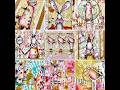
This is the lesson I'd been looking forward to. At least before all the drama I created for myself! As many of you know, I'm not a scrapbooker (probably because I have such a lousy camera), I don't make cards (probably because I'm not much of a stamper) and I'm not an artist (I couldn't draw an image if you paid me). But I love to make collages and the best ones center around images I find in magazines.
However, before we begin our magazine and frames journey, I thought I would show you what my work table looked like yesterday morning.
 I decided it was time to change the table covering which is red rosin paper that has been covered with various paints I've slopped onto it. Then I added a bit more paint and allowed it to dry. You'll understand why in a few minutes.
 I'm not always in a position to supply an example of one of my backgrounds, but here is a bit of that same rosin paper after I cut it into the shape of a house and outlined the door and roof with gesso. I dipped a plastic shopping/credit card into the gesso to make the patterns.
I admit I wanted to have a bit of fun with this one, so I named it "Ded Barn At Sunset." I had Led Zeppelin on the brain when I was making the house. I figured if, based on the spelling, that band could make the word sound like LEAD (led) because they didn't think we Americans could pronounce it correctly, instead calling it LEAD (leed), then I could do the same for DEAD. And I thought the house/barn really did look dead!
 I started this house last week, and added the stylized tree this week. Didn't I tell you I can't draw? Not even simple shapes!
 And finally, here is the color background I made last week, but after I stamped the rocking horse, forgot to show the finished spread.
Now that you're all caught up, let's get to this lesson which, as you already know is:
Magazine images and frames
Magazines are everywhere. Some trade magazines are even free. Some are from a subscription, some from friends trading them.
Let’s talk about archival qualities. Remember way back in lesson one and again in the previous lesson where I pointed out that we don’t worry about archival when working in an AB? Well, that’s basically the case when using magazine images. Although there are some coated, higher-end virgin magazine paper such as that used by National Geographic, most news magazines and catalogs are made from recycled or coated lower-end virgin paper. This means these magazines have pages that are acidic.
Speaking of National Geographic, it is made of glossy clay-based paper. It's a little different from normal paper as it contains a clay compound called kaolin. The clay is used to fill the spaces between the fibers in the paper and to coat the paper so that it will have a smooth surface. This makes the paper more suitable for the reproduction of photographs, especially color photos. National Geographic also does something called "buffering." This takes the paper from the acidic side of the spectrum to the alkaline side, making it completely safe to use with your photos and in your scrapbooks. It’s also the reason you can perform so many unique background techniques using National Geographic.
Papers with a very smooth clay surface and low cotton content are great for packing tape or liquid Sculpey transfers. In case you have the money, Hammermill Color Copy Paper in Photo White is one brand that has a high clay and low cotton content. That makes it ideal for any transfer technique where you need to use a toner copy.
Magazine images can replace the more costly high end scrapbook paper for backgrounds, or the more costly images you buy. Consider looking at the pages in a different way, turning them upside down or looking at them in a different light. That rug on the floor of the high rise apartment is a possible ATC background. That dress on a model can turn into a border.
 One warning. You must use a dry glue with magazine images. Believe me, I’ve ruined so many magazine images (and consequently the spreads they go in) because I’ve tried using Elmers or some other "wet" glue. Wet glue causes the images to buckle or dry with bumps because you seldom get an even spread. Now I use a glue stick and pray that the image stays until I finish the book and get it photographed. As an aside, do you see where I got the "wheel" I stamped with last week? Yep, the Glue Roller.
Another warning. Magazine images are addictive. Once you start playing with them, using them in your spreads, or cutting them into pieces to make other images, you are hooked! To keep clutter to a minimum, cut or tear them out of magazines and store them in a way that makes sense to you. I use file folders labeled with generic words like "women," "eyes," "butterflies," etc. in alphabetical order in a 2 drawer file cabinet. Some people prefer to file them by color or pattern, but that just doesn’t seem to work for me, although nearly all other storage is sorted by color.
 Here are some of the images I used in my "Hands AB."
 Although I used to get some pretty decent freebie magazines, lately, they are mostly trade magazines that are made up of words on the pages and no useful images.
 With that in mind, I used those columns of words to create what I call the "Winter Cabin in the Woods." I am not sure how an Aspen is supposed to look, so here is my interpretation of the trees. Again, I used gesso for the snow and a Zig pen to make the bark.
One of the things I struggle with when using magazine images is how to incorporate the image and make it look like it meshes or blends into the page. Although sanding the edges of the image works on occasion, frames can help make your magazine images look like they fit on the page.
 Just about anything can be used as a frame. Here are a few ideas to get you started. You can also use postage stamps, buttons, rubber stamps, ribbon, and any type of tape you have. Since many of you own die cutting machines, see what dies (other than the Nestables) you can turn into frames. I used magazine images while demonstrating how I use frames, so this should reinforce how much I love working with magazine images.
 Keep an open mind when thinking about your choice of frames.
 Here I punched a hole in a game card to create a frame. You can place an image behind it and create a fun or whimsical look, similar to what I did in my "Money AB" that I show below.
 Remember how I said I needed to remove the rosin paper from my work table? It was because I had stupidly left my craft mat under the rosin paper, and now seemed like a good time to retrieve it.
 I needed it because I wanted to do some stamping on wide masking tape.
 I even auditioned more stamps to see how they would "measure up."
 I liked the idea of using the masking tape as a frame because of its translucent quality. Although this is not a magazine image, I did pick this "how to" sheet up a few years ago at Michael's.
 For this frame, I used a papery type ribbon that had lots of texture. I used the masking tape as substrate for the stamped focal image. Of course, not being much of a stamper, I used a pigment ink and it wasn't dry when I applied the ribbon frame.
 For this, I sewed a sentiment onto a napkin. I had big intentions of using this rocking horse along with Christmas inspired die cut scrapbook paper and buttons, but after I assembled the background, I realized the horse would not fit on the page.
 This isn't the first time I have cursed this altered book for its small size. Needless to say, I don't really have the right book OR the right theme to provide adequate instructions for magazine images and frames.
 That's when I decided to revert back to pages I showed from the last class I taught. After all, the tutorial is what really counts.
For this technique, you will need either two consecutive pages if you are doing one frame, or four consecutive pages if you are doing two frames. You will use the left and right sides of page one and the left of page two if you are creating a single spread. Page three will be the same as page one, and page four will be the same as page two for a double spread. I hope I didn't lose you. Hopefully the photos will help.
 Remember I am making a double spread, so I began by decorating the left and right sides of the pages. I used three glazes and a sea sponge for the background.
 While the background was drying, I painted a page of vintage sheet music using the same gold glaze I used on the front (two pages in my case).
I decided to make two frames since I had two identical images (except for size). One image had been in the contents section and one in the article. I cut the images to size and laid them on the now dry sheet music for measurement.
 I measured and cut the sheet music to the larger image size. I could have cut the one that would go behind the smaller image a different size, but this was easier and I had plenty of sheet music to play with.
I glued the sheet music decorated side up (facing me) on the back of the page (page 3 in my example). Be sure the decorative paper (if you use it) is glued securely and completely.
 I repeated for the left side (the sheet music is on the back of page two), then glued the magazine images to pages one and four. Be sure the image faces the sheet music (in my case) and the decorated backgrounds are on the back side of the sheet music (what I used in my example).
 Draw a square (or shape of your choice that will match your image) that is just slightly smaller than the image on the facing page(s). I’m not sure you can see it in the photo because I used a pencil, but draw diagonal lines
  from corner to corner (as shown), then in quarters.
 You can use your craft knife and self healing mat, OR you can use your scissors to cut these triangles. They don't need to be perfect.
 When all of your lines have been cut, turn to the front of page one (or your middle pages) and grab one of the triangles. Roll it on a pencil, knitting needle, or bamboo skewer. Secure with a bit of glue. Repeat for the seven other triangles.
 You may have to fiddle with the rolled triangles and add extra glue if they begin to unroll. Don't even ask how I know this! Repeat for the other side if you are doing both sides.
 Glue page one to page two, and page three to page four. Admire your finished spread. One nice thing about having one image smaller than the other is they nest well when the book is closed.
 When I was worried I wouldn't be able to show any photos of frames and magazine images, I went looking for examples of frames I had made in the past.
For this spread, I echoed the bandage on the hand in the magazine image with real bandages for the frame. I began by laying down gesso, then added strips of pages in the form of a frame from a supply catalog while the gesso was still wet. The gesso was my glue, which I used both under and over the catalog images. You can see that these catalog pages are very thin, so they buckled under the water content of the gesso. This means they have a very low cotton content and are not acid free or archival.
 I suspect all you scrapbookers have seen the technique on the left, where I began with a wreath style frame, and added images around the wreath. Unfortunately, I covered up most of the wreath, so it's a bit hard to see the technique. However, I really liked how the page turned out. And to think it was made using all freebie magazine images.
For the page on the right, I used various paints and glazes for the background, then cut a circle in a very realistic looking faux ten dollar bill. I placed the vintage image, which did NOT come from a magazine, behind the money.
The pages directly above and the ones directly below are from my "Money" AB.
 The magazine image on the left is a classic example of how to match your image to a spread. Although the background is simple colored tissue, it was distinct enough to show the hole I cut in the advertisement. I left the rest of the image intact. Those of you who know me, know I used scissors, not a craft knife, to create the hole. But it was a perfect image to work with.
On the right, I created a beach scene out of (from bottom) sandpaper, scrapbook paper, embossed vellum, more scrapbook paper, more vellum, more scrapbook paper, and the colored book page. I found the beach chair, ball, and umbrella in a magazine and knew what I was going to make. The boat was an after thought, but one I was thrilled with after it was finished. I used faux money to make an origami boat. The sail was also from a magazine image.
 "High Five" came from my "Hands" AB. Although technically not a frame, it was a way to use an image that a partial area had to be cut from.
 When I started my "Hands," "Time," "Money," and "Asian" ABs, I had been saving magazine images for years. When I saw a quote or saying dealing with one of these subjects, it often piqued my interest or sparked a concept for a spread. This time it was "Handsome," and when I read the word, I went looking for an image that would fit the bill. I drew a hand around the image, then cut it out and tried to create a shadow. Since I didn't have any charcoal, I used a regular graphite pencil (number 2, I think), then erased it. Not sure I got the effect I wanted, but I tried. The background is blue pigment ink. I added the swirls from a stamp. Unfortunately, this is a photo, not a scan, so it's not too crisp.
 I will use any image that fits the bill. It helps to have a lot of images. I started with the right side and cut some beige card stock I used on the background for both pages. The right side began with a magazine image. I imitated the color in the cartoon using the direct to paper method and blue ink. I also colored the green tickets to make them more like the color in the cartoon. The words "high five" were right off the cardboard container holding the blue hand buttons (used on both spreads).
I got to looking at the stitches on the guy's black jacket in the left image, then thought it looked like a jean jacket, and remembered a small piece of scrapbook paper I had. I turned it into a sleeve and cuff, where the cuff is raised using dimensional tape. I wanted it to look like the image was coming out of his sleeve. It's much less dimensional in the scan, than in the book.
 This page began as an example of frames
 to which I added a few magazine images.
 Next I doodled around the stickers and added the words "Your FATE is in your hands," "Destiny," and "Go green" (located in the lower middle, which I apparently cropped) using a stencil and my Zig pen.
 All images are from various magazines or junk mail, as well as a bit of security envelope that I sewed to the page and glued to book pages afterward.
 It's hard for me to see my own handwriting, but I really wanted to make this two page spread about how the first AB class I taught came about. I began the background using "Warm Milk" and "Teddy Bear Brown." I mixed the two colors together a bit more than I originally intended, but I'm still happy with the results.
I used a brown Sharpie to write the words. I had enough room on the page, so I was able to use the Sharpie without it making a mess when I wrote the words. The left side reads:
"It began with a concept. No money would exchange hands. All that was needed was an internet connection and to be plugged in."

"One hundred twelve people contacted me. I could only take 99 because Blogger restricted the blog size to 100. I never would have guessed the turn out would be this positive. What fun we had using our hands and a mouse!"This is a perfect example of paint and magazine images. BTW, it was a private class that required membership, not this open class I'm teaching now.
The beauty of this AB was, it started as the book I used to teach the on-line beginning AB class. Later, it became a keepsake I can hold onto forever.
 Do you see how each lesson builds on the next? For example, for this spread I cut two different, but similarly painted sheets of deli paper into four sheets each and adhered them to the two pages. I used the color and background lessons to start this page.
I kept getting the same images in my trade magazines that were advertisement for something. I used these same three hands often, and continuously tried to come up with different ways to use them. It was the same for the left image, too.
 This time the same magazine image called out to be used on this abstract background. The title is made up of various sticker letters.
I only wish I had allowed myself time to scan more photos from other altered books, but I feel you have enough information that you should be able to get started making spreads using magazine images and spreads using frames.
Review:
Magazine images are not necessarily acid free.
Some magazine images/paper will work better than others for tape transfer.
Magazine images can be used intact, cut up and rearranged, or used as backgrounds.
Don’t forget to collect words as well as images.
Frames can be made from anything.
Frames establish a cohesive feel to a page.
The easiest frame is a rubber stamp in the shape of a frame
Dies have taken center stage lately and many are in the shape of frames.
A more difficult frame involves cutting a window and rolling the frame.
Assignment (totally optional as usual):
I look forward to seeing your creative use of magazine images and frames. For this lesson, create at least two spreads that incorporate magazine images and two that incorporate frames. These can be the same spreads, if your pages are limited. Be creative and have fun with these. Remember, they don't have to look anything like mine.
Supplies you will need for Lesson 11:
Your book
Your imagination
Paint, ink, glue
If you happen upon a garage sale or thrift store, you might want to pick up a zipper. I realize it won't be needed for another four lessons, but it never hurts to plan ahead.
As always on Sunday night, I'm linking with CED (Creative Every Day).
I can't wait to see what backgrounds you played with for this lesson's homework assignment. This should have been a fun and constructive assignment. Please remember to show your homework assignment when I ask for it. You have two weeks to post Lesson 9's assignment (your backgrounds), but I suspect many of you are ready. And please be sure the link is to the specific post or posts, not to your blog in general. And I want to thank all of you for turning off that annoying word verification. You are the BEST!! I've only seen it on a few blogs lately.
You may also post ANY previous assignments here. If you are showing any assignment prior to Lesson 9, just add the lesson number after your name, please.


17 thoughtful remarks:
My favorite. I love magazene images.
blogger did a real number to your font, didn't he?
XX Rachel XX
You did it again, Elizabeth! Such a treasure chest of information, with such good examples. Sorry for your frustrations with Blogger -- it can be very contrary! I love the colors in your collage -- such fun! BTW, you ARE an artist!
WOW Elizabeth, one of the days I am "glad" I wake early so I can have a read through before getting DS up for school etc. I really could have done with this lesson ages ago as I have been using wet glue on my magazine pieces! It did occur to me that I should be using a dry glue but somehow I always reach for my wet one. Hopefully I will remember from now on. Am loving the curled page frame, will definately have to try that one, wondering how many pages I can spare.....Thanks BJ
...WOW Elizabeth what a super informative posting...loVe all your art work at the top of page & I loVe your arty tree too...so much amazing tried & tested elements have gone into this post your wonderful & very talented lady to give so much to us...have a totally fabby day...Mel :)
Thank you for your loVely comments it's nice to know i'm on the right track and you can use anthing from my blog if needed ie the wire frame all I ask from anyone is a reference back to me...xx
Have to say I put pieces of card under the pages I am working on but as I painted over the edge and then happened to move the card as it wasn't big enough, paint was transferred to the previous page from the card. I suspect I'd have the same trouble with wax paper, if I had any of that! Think I ought to just get bigger pieces of card and NOT move them! BJ - we live and learn............
Wow! Lots of creativity going on here ~ very expressive and eclectic ~ ~ enjoy the day ^_^ (A Creative Harbor)
You just keep getting better and better. This is gonna be my favorite lesson to do. I'm linking my backgrounds and I'll be back when I get my theme book page done. Thanks so much, Elizabeth. All these examples are so very helpful
Another wonderful lesson here, need to focus and take it all in. All of your pages are fabulous, I love the rolled back window really focuses your eye on the image inside. Apologies in advance, this fortnight's homework will be very late, but I did finish lesson 9 and it is posted.
You are an artist to me- I love your creativity your sense of color and composition! As you said each lesson builds on the next (relating to the art) I was struck by how each life lesson builds on itself too. Thanks for another fabulous lesson!
Innovative art pieces. Nice post. You are indeed very creative.
I love the rolled back frame technique and would love to be able to do that one! Thanks for such wonderful descriptions, as always i am really enjoying your classes! waving hi from the hills of North Carolina :)
A generous post Elizabeth. I like the way you work.
Love the curled back page...I'm sure you know which one I mean. Very cool technique!
Aha!! I am so far behind now I wonder if I will ever catch up but I know I will enjoy this class because I can work with images and frames without having a nervous breakdown!! (Do you think you would notice if I skipped some your messier lessons)??? LOL This one has actually made me want to sit at my desk and play and I can't remember the last time I felt that urge!!
Wow! so much information! I will have to come back and read this all again. Thanks!! :)
Hi Elizabeth, thank-you so much for another amazing lesson, can't wait to start playing again. Ooh, please give Bleubeard a tickle for me, he is gorgeous.
I have linked in my lesson 9 efforts for you, my apologies for the long post but I had so much fun I wanted to share it all including the thought processes as well ha ha. The final page is not really to brief I admit but I am determined to incorporate it in my book somehow so I decided to post it too.
Many hugs
Dawn x
I did post my theme pages but I'd also like to try the rolled frame and the cut out page as well. You keep us busy, Elizabeth!
Post a Comment