






.JPG)


Kaleidoscope: Ideas & Projects to Spark Your Creativity
by Suzanne Simanaitis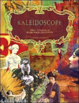
- ISBN-13: 9781581808797
- Publisher: F+W Media, Inc.
- Publication date: 12/28/2006
- Pages: 144
- Product dimensions: 7.98 (w) x 9.70 (h) x 0.47 (d)
 This is what the book looked like on my craft room table. I thought the collaged images were quite well done and was anxious to learn ways to improve my composition skills.
 It didn't take long and I realized how difficult it was to read even the first pages. You can see in this small space I photographed, there are three different fonts and one of those fonts has two different sizes.
  That continued in the table of contents.
 Now I like bits of change, but this was difficult to take. Be aware this is a close up of the TOC, which you are seeing through my viewfinder, not as it would normally look on your table or in your hand. The font was quite small, even though I don't need glasses to read. And the titles were quite light relative to the page numbers.
 Again, the different fonts and a distracting background made reading difficult. This was one book I was really, really, really ready to skip over.
One thing I liked was the author's take on using magazine images in collages. You have probably noticed I also use a lot of magazine and junk mail images in my art. I never buy images, and am not one to print them for use in my altered books.
 There were over 30 artists who created art and/or wrote articles for this book.
 Suddenly the background turned black and the font turned white.
 Some fonts were especially hard to read, like the one chosen for "Selecting a Color Scheme," seen on the right.
 Next came the red font over a green background,
  which was somehow supposed to be associated with making a crown honoring Frida. Mother Nature (see last sentence in red above) might not be consistent, but font in books should be! And the colors on these two pages set my teeth ajar.
 When I first saw this two page spread, I thought it was created by Michelle Ward.
  I thought I might learn something here, but it was just a rehash of things I had learned years before I started making collages.
  I thought I should read this entry, since I need to purge a few things, too.
 However, upon closer inspection, this was not so much about purging as it was about your design habits. And the author didn't bother giving much advice about HOW to purge, only that she DID purge.
I did appreciate that she sorted by "sale, keep, and trash." I would have skipped the sale items and donated them, since I've learned that garage sales are just not worth the cost and time involved. Besides, you can write off the donation on your taxes, and you can never recoup your losses that come from garage sales. Garage sales bring out the worst people who want the best bargains. If you price something for twenty-five cents, there will be some who want it for even LESS. I know some of you are nodding now.
 Again, this was aimed at decorating more than setting up a real studio. For example, there was no thought about the TYPE of studio appropriate for the individual. Some people need a wet studio, some only need a small cubby with a few writing pens and tablets or journals.
 Most organizers (and yes, I consider myself one) believe in zones. If you don't have zones, you have chaos. And the zones must make sense to you, too. That's why I can't come into your space and set up your area to look like mine. It would never work!
 Here the artist/author used various magazine images to imagine a tranquil space or spaces.
 This artist/author asked you to imagine your new space
 by first creating a collage of your dream space, then showing the final project. WOW, even my computer is newer than hers!!
 This seems too ethereal (or perhaps esoteric) for the way I might envision a new dedicated art space. I suspect I really AM too literal (see #2 above) about my work spaces, since I have been known to get out my tape measure and jot down dimensions of walls, furniture, etc., on graph paper before doing anything else.
 Again, this is more about decorating your space than making it functional. It was certainly time to move on.
  This gal showed, through use of her own photos, how she uses her bed to make art in the winter.
 The next section was on Imagination, and it focused on board books.
  Being a mixed media artist, I've created several board books. This might be a new concept for some, but I got nothing out of it.
 I've tried covering a board book with gesso before, but found you should remove the glossy paper first. It's harder, but the book (and your art) will last longer.
 I've never made a real abstract collage before, but I decided to accept the "assignment" "Home for the Soul."
By now I'm sure you can tell I did NOT like this book. I had a hard time with the various fonts that changed as I turned the pages. I also had trouble with contrast. It took a lot of effort to get through this book because of that. The small font on the decorative backgrounds made it difficult to read in many places. I didn't bother photographing any more of the chapter that used red font on green backgrounds. That was actually jarring for me. I don't care how young you are or how good your eyesight, it is definitely not easy for anyone to read. I can see how my older friend Kathy had trouble with it.
Although the stand-alone artwork was stunning and I actually DID enjoy most of it, there was too much hodge-podge. For example, even though each chapter began with artwork that had artist credits for the work, you had to guess who did what as they were all layered together in no specific order. I suspect the fact it was in Zine (or article) format was part of why I wasn't happy with it.
There was also too much angst for my taste, as well as ethereal thinking. All that talk filled pages, but it didn't encourage me to make art. I couldn't get through this book fast enough. In fact, I found myself skipping entire paragraphs when the talk was less about art and more about subjective feelings. Subjective feelings are fine when talking to a good friend, but NOT so when you buy an art book. I'm less about personal feelings and more about learning new techniques. It was obvious I learned nothing new.
Had my art gotten stagnant or had I hit a dry spell, this book would NOT have sparked my creativity. Had I bought this book and wanted to learn new techniques, I would have been very disappointed. Please don't even consider buying this book, unless you want to explore your inner self awareness and see a few bits of art along the way.
But Darcy and all my ARC friends expect some type of art, especially after I took so many photos. Below is what I made from the "assignment" "Home for the Soul." And yes, this is my first ever true (said laughing) abstract.
 On the right I represent myself in a skirt and leggings. In the middle is my top, as disjointed as I felt after reading this book. On the left are areas for Bleubeard to romp, hide, and play. Size of the piece is 8" X 10" (20.32 cm X 25.4 cm) and it is painted on canvas board using acrylic paint, some metallic, some not.
Thanks to all the ARC reviewers I have met over these past 12 months. I've really learned a LOT from you, and have totally enjoyed all the art. It's been a fun adventure and I am sure we will all cross paths again (as some of us do already). And I want to thank Darcy for hosting this event. I finally read 12 books I might never have gotten around to reading had she not encouraged and hosted this challenge. I hope to see you in 2014.










 Dollar Exchange Rate