I'm once again joining my friend Neet at Hickydorums, our host this month at Art Journal Journey. By now you may know she has chosen Type as her theme.
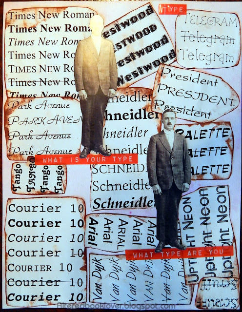
 Earlier this month, I computer generated several fonts that I formatted in very specific
font properties: original font, bold, italic, shadow (which didn't
print the shadow), small caps, strike through, and bold/italic. In order to get them all on the same page, I removed some of the excess font properties. However, I kept all the strike through and the small caps properties.
 For this page, I began by combining
two colors of pink Staz-on reinkers to which I added 91% isopropyl
alcohol. I spread these on a sheet of 110 lb. cardstock and allowed the
alcohol to dry.
 After fitting all the fonts on the page in a dry run, I outlined each font using brown dye ink. It started to look like a puzzle with individual puzzle pieces. I then adhered each font to the page using a glue stick.
I've had three Dymo label makers with three different fonts for years, and all of a sudden, only one would work properly. I had planned to use two different label makers, but I was just glad one worked properly for this page. Once I adhered the labels, I added the two TH paper dolls.
Thank you beyond belief for visiting today. Bleubeard and I
are delighted you dropped by and hope to see you soon at Art Journal Journey with your own take on Type.


.JPG)


22 thoughtful remarks:
Another very clever take on the theme. Colour me awed. Again.
Love this. And weee. I remember these label makers! My Dad had them in black only but THIS is the color of the happy 70`s, how cool is that!
I need to find out if you can buy them here (or at amazon), too!
The Emperor might turn into a label Queen, LOL.
No, really, I want this!
Elizabeth, what a lot of work you have put into this page but boy oh boy, has it worked! I love it! Whenever I have used different fonts I have forgotten about things like using 'all caps' and 'strike through' and I never even knew about 'shadow'. Plus you have some really cool fonts there making that a very interesting and eye catching page.
Love how you have turned them about and so patiently edged them in brown. It really is a clever and eye catching page. The two identical TH Paper Dolls are perfect and I love the Dymo labels. Still use mine and love it.
Thanks for this, a great page for my theme at Art Journal Journey.
Hugs, Neet xx
Fabulous page Elizabeth, you put a lot of work into getting it together. And I visited the cat, although my sleepy brain took some time to 'get' it! I love the dymo label makers and never thought to use them for this challenge....Have a great day, take care, hugs, Valerie
A fabulous page with those paper dolls and all the different fonts Elizabeth.
Thanks for your comments on my pattern page. You wondered how I managed to create it so quickly. I have a basket of colourful torn paper squares and rectangles, and using a glue stick means they were very quickly glued down. And I used Paperartsy Fresco acrylic for the stencilling, which dries very quickly. I have a few of those flowers already sketched and cut out after the collage fodder course. So that's how I can work so quickly 😉
Blessings,
Alison
You did a great job. I am reminded that I have a small Dymo label maker which I think is kept in one of my drawers. Have a wonderful Wednesday.
This page made me smile. I'm a Times New Roman girl.
Interesting page and well done. Im sometime courier and sometime ariel. Have an amazing day.
This is a fun layout idea!
I always loved paper dolls when I was a child, but I've never seen any like these. Mine were usually almost undressed (like in a bathing suit) so that various paper clothing designed to fit could be attached by little tabs. Cutting out the dolls and clothing was very challenging!
best... mae at maefood.blogspot.com
I'm definitely a different type than that dapper figure ;) I like your design here (or composition, or whatever y'all call it. I am so not up on art vocabulary *sigh*)
I really like what you are doing with the type fonts. Love the graphic, too!
I really like your page Elizabeth, it's wonderful. You have been able to combine all the types of letters so perfectly, and the result is incredible. I also like very much how the edges have been, with that brown tone.
I hope you are having a good day, and I send you lots of hugs,
Caty
What a great idea for this theme! Well done!
Clever! I love it.
we like de way telegram font looks !!!! ☺☺☺♥♥♥
I have a page to post with different fonts, but not like this. I really like how you did this one, with actual fonts all over the background. It is true, we all prefer certain fonts. I also like the red label maker tape too. The colors is a nice pop on the page. Hope your week is going well and is cooler than we are. Hugs-Erika
In college, I set type by hand the first year. Then computer-generated type for the headlines began, then quickly all the "word processing" although it was so primitive by today's standards. I love type!
It amazes me how you just never stop creating the most interesting peaces. Love your art my friend.
This is a really fun, great page! I love it! A very clever take on the theme.
Your blog is amazing.
I love, love, love all this font and the guys make it even more fun. Super cool page, Elizabeth! Hugz
Post a Comment