It's Thursday, so that means it's time to show my contribution to Rain's weekly Thursday Art Date. This week the theme is Space. I may have taken a different view of space this week.
When I taught the altered book class (see my right sidebar), one of the elements we touched on was Space. I defined space as the distance or area between, around, above, below, or within shapes and forms. Shapes can be arranged in space in many ways, such as in rows, overlapping, or by size to show distance.
Both positive and negative space are important factors in every good
composition. Positive Space is created by any main element appearing to
be in front of the background. Negative Space is the area that
surrounds the shapes. They occur in both two-dimension and
three-dimension art and complement one another. One impacts the other.
 Positive space is the "occupied" areas in a work of art that is filled
with something such as lines, colors, and/or shapes. It is the primary
subject matter of a painting and a collage. It is the part of your
spread that forms your area-of-interest. It dominates the eye and is the
focal point in the composition.
Positive space is the "occupied" areas in a work of art that is filled
with something such as lines, colors, and/or shapes. It is the primary
subject matter of a painting and a collage. It is the part of your
spread that forms your area-of-interest. It dominates the eye and is the
focal point in the composition.What was hard for some to understand was negative space. Negative space is called white space in journal and AB layouts. It is the
unoccupied areas that surround the subject matter. It is more passive
and is defined by the edges of the positive space it surrounds. It is
what gives definition to our composition and layouts.
 Negative
space is important in any AB spread because it gives balance to positive
space by giving the eye a place to rest. This is a basic element that
is often overlooked as a principle of a good design. Sometimes we are
so focused to get everything on the page, we overlook the fact the eye
needs that all important resting place.
Negative
space is important in any AB spread because it gives balance to positive
space by giving the eye a place to rest. This is a basic element that
is often overlooked as a principle of a good design. Sometimes we are
so focused to get everything on the page, we overlook the fact the eye
needs that all important resting place.This is SO much easier to see and comprehend as negative space than the positive space image above, even though they were created basically in the same way.
Although both of the above are examples of positive and negative space
in my rocking horse AB, you can see how different the space around the
image is perceived and the impact it creates. It is SO much easier to
"read" the second image, than it is the first.
There is also perceived 3-D space. 3-D illusions or cues occur when a sensation of space which seems to
have height, width, and depth are visually created through various
techniques. These illusions of 3-D space include overlapping objects,
changing the size and placement of related objects, linear perspective,
atmospheric perspective, along with color hues and values.
 The easiest way to create the illusion of 3-D space is overlapping objects. Returning to my Rocking Horse AB, I tried to show this overlap. The effect was achieved by allowing the contour of one rocking horse to
be interrupted by the contour of another, so it looked like one rocking
horse was physically sitting in front of the other. Those of you who
are stampers may have stamped more than one image (as I did above) by
masking the first, then stamped the second time with the mask in place.
You have created that same 3-D illusion!
 Putting the altered book lessons aside, I called this my Space Saver Space Cadet. This was for a challenge at Art Journal Journey.
 Space was represented in another Art Journal Journey entry. In case you need the interpretation:
July 19, 1969
That is one small step for man
and has practically been
forgotten after 50 years.
I had hoped to be traveling in space in my golden years, but it appears
that will never happen. When did we forget how important space
exploration was? Was it when Apollo 13 wasn't even covered on
television until the lives of the crew were suddenly in danger? Was it
after Apollo 11, people gave up caring because we had "conquered" the
moon? What caused us to lose interest so quickly? I'm hoping the new Mars project will spark our interest in space again, especially young people.
Now for a few photos.
 I'm so proud of our Cosmosphere, which has even more authentic space artifacts than the Smithsonian Air and Space Museum. In fact, the Smithsonian has outsourced projects to the Cosmosphere because the researchers and workers are so capable of repairing and lovingly handling the pieces.
 Space, the final frontier. A bit of Star Trek to end this week's look at how I treated Rain's Space Thursday Art Date.
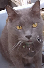
All photos taken by me, all art created by me. Bleubeard wants me to remind Squiggles to stay out of his space.
Thank you ever so much for stopping by. I am truly grateful to you,
my friends, followers, readers, and lurkers for visiting. Please also join me at Rain's Thursday Art Date.


.JPG)


19 thoughtful remarks:
Thank you so much for your explanations (and illustrations) on positive/negative space.
I like the 3D effect of the rocking horses.
I agree with you about the importance of space exploration but at the same time I feel that so much money has to be spent on that when there are so many problems on earth still to be solved.
In the late 80's we visited the Kennedy Space Center in Cape Canaveral.
Have a lovely week Elizabeth.
A wonderful statement about the space and great page. In addition, about space exploration, it was all exciting!
Have a good day, hug Elke
Funny, that! On one program on TV the theme this week is... Space!
Three-dimensions is OK - I still suck at the ending of Rudy Rucker´s "Fourth Dimension"! My brain is too dumb!
But with this beautiful works and explanations I might give it a - haha... third (!) try.
The horses really look 3-dimesional, fascinating!
And can you imagine Ingo thought the events of July 19th in 1969 were but a comic?!!! As an excuse it was in the middle of the night here and he was a 4-y-o, dragged out of bed and dreams...
See, I still have to finish... what a post you gave, dear! ... Brian May´s 3-D-book of the Moon!!
Oh, Bingo!
I have to watch TOS tonight (in the Original, have them sitting on the board)!
Did you know I have the full James Blish series right here?! All from the 60´s, second hand from all over Australia!
I enjoyed this post immensly, thank you, Live Long And Prosper!
Some great examples for Rain's Space theme! xx
That's interesting about your space museum. I've been to the Smithsonian Air and Space Museum at Dulles Airport (and the smaller one in DC) a number of times and very much enjoyed seeing the space shuttle and many other artifacts, as well as the regular planes and history of aviation.
be well... mae at maefood.blogspot.com
You have some wonderful takes on space. Although I don't join in, Rain does have some great topics. This one is abstract in some uses, and it is interesting to see what you did with it. I remember the moon landing one but not the frig nor the city with the key. Fun to see those again and for a first time. I like the city background too. Hope the week is going well. Hugs-Erika
Wow! you really nailed the theme this week. I love the art and your lesson space. Have a great day today.
I love your cityscape! What an inventive take on the theme :)
A wonderful take on 'space' Elizabeth, great post.
These are all really interesting and thoughtful observations of space in art. Perfect for the theme!
Beautiful and love this post as always. xxx
Interesting take on space in the first art pieces! And yes, when did we lost interest in space exploration? I still watch and follow the news from every new rocket starting into space, launching new satellites or rovers. The Mars landing of Perseverance was a master piece. Would love to travel to space, too. Have a great day, Elizabeth!
Bravo some very interesting responses to the prompt
much❤love
interesting! At first glance at your first image I thought Maze! So many paths to get lost in in this closed up space :)
Love the Rocking Horse.
Many different ´space´s in your post. :)
I'd never really thought about space until Rain's request. I'm grateful for your explanation of positive and negative space. But, I am really interested in what goes on in outer space, especially what Mr Musk is up to.
Welcome back ... I feel I have been schooled on positive and negative space. I know I was aware of them, but your explanations was a good reminder of things I had forgotten :) As for your Space Saver Space Cadet, I see a dinosaur wrecking havoc and a little dog barking at him. Is that me ... or was that your intention :) ? Space exploration went away because it was too expensive for those who managed the purse strings, sadly. I remember, only too well, our astronauts landing on the moon and nervously awaiting their safe return to earth. There have been many advances in space explorations sans man (i.e. no men on board). At the rate we are destroying our own planet, I think we need to look into being able to fly the masses to a new world both to explore and to survive on. Welcome back, my friend and Bleubeards concept of space sounds like Izzi's, but not Chachi and Buffy's ... they can't seem to get close enough to each other. So as I have taken up enough "space", I will wish you well and say goodbye until next week when I assume we will meet again ...
Andrea @ From the Sol
I'm a real fan of Star Trek, and recently watched a few of the older episodes. It's so fascinating to see that Leonard Nimoy was in the old Mission Impossible series, and was a guest as a killer on Columbo. Such a talented actor that is truly missed. What a great idea about putting like items together to give a 3-D look! I'm going to give that a try in one of my planners. Thanks for the tip! Happy Weekend and hugs, RO
That was so cool to read! I had lots of problems understanding negative space a few years back, then suddenly it hit me and I figured it out. It's like Algebra lol...at least for me. When I was learning it I just couldn't get it, but then overnight pop! Understanding. :) I love your 3D horses and you explained all of that so well! The museum photos are great! I'm a fan of the original Star Trek...mainly for William Shatner!! :) So glad to see you back! :)
Post a Comment