It's time once again to join Sami at Sami's Colourful World and her Monday Murals. Even though it's still Sunday in my world, please be aware
that Sami's mural link goes live at 11:01 a.m. my time today. Today I have two murals for you and they are both located at The River City Brewing Company.
 This mural has definitely shown it's age, although it may have been a beauty when it was first created. It may have paid homage to the arts. I love the old light that was part of the mural. I just learned it was painted by Steve Murillo in 1993.
 Because there were so many people coming and going, I didn't want to climb the stairs and get a close-up of the flag. Unfortunately, the hogan, the blue and white in the center which, by now most of you know is a Native American symbol that stands for home, was at least partially obscured in every photo I took.
This flag (and the other peeling mural) is located at River City Brewing Company. The address is 150 North Mosley in Wichita, Kansas (USA). The flag was created in July 2017 by muralist Johnny Freedom. You might be able to see part of his logo with the large "J" in the lower right corner of the flag's white stripe.
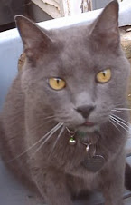
If you enjoy murals from around the world, please don't forget to visit Monday Murals at Sami's Colourful World. Thanks for stopping by to visit Bleubeard and me. We are both grateful you took time to join us today. We gladly visit every mural participant.


.JPG)


26 thoughtful remarks:
Thank you - I really liked them both. Co-incidentally my Sunday Selections includes a mural this week.
Too bad the first mural has fallen into disrepair. I'm interested in the clarinet that's in the young man's hand -- I wonder about the original intention of the artist.
best...mae at maefood.blogspot.com
The first mural is lovely, pity it hasn't been restored, but even faded it really has something! Have a great day, hope you are feeling better now! Hugs, Valerie
great your post
Sad about the first mural. But nice they let it age like that!
You really have a cool flag. Hm. We don´t! We certainly have Henry, but not as flag as far as I know.
"... one beer" - was there more text? The tree blocks it "... at a time"?
Fun! Reckon that´s a crafts beer bar with many sorts of beer?
That mural must have been a real beauty when it was first painted
I like the light in the first mural. A little facelift would be a nice treat for the lady depicted in in. Hope you are feeling better.
The first mural looks like a beauty. It does need a little TLC, but even so, it has a great vintage look. The flag is nice too. I love how there are so many Wichita flags on so many of your city buildings. happy end of the weekend!
It would be lovely if someone would restore that mural.
That first mural deserves to be restored as it's quite pretty. The flag is very nice as well. Thanks for participating in Monday Murals Elizabeth.
Wonderful murals Elizabeth! I love that aged one!
I hope you're feeling much better now.
Alison
beautiful murals
Many thanks for sharing both of these murals.
Although the first mural isn't in the best condition I do like it.
I do hope you are feeling better.
All the best Jan
So interesting about the flag and it's native American symbol, I think the peeling paint really adds to it's character. I do love a brick painted wall, a grand backdrop with the iron railings.
Hope you are feeling much better now Elizabeth?
Have a great week Tracey xx
... find the aged look to the mural appealing! A good find.
Super gorgeous nurals post, love all of the delights here. xx
I love the first mural. Indeed, it is showing it's age, that makes it special, very special!
It would be nice if they could repaint that first mural. :)
I love the decaying mural!
It looks pretty good for being from 1993
I'm sure that was a very pretty mural. Interestingly, even with the peeling wall (and the exposed bricks on that wall) there's a certain charm to it.
Thank you for the information on your city's flag and what the Native American symbol means. A lot of learning happens here on Monday Mural. <3
Have a lovely week, Elizabeth. :)
Nice finds!
Great mural.
Great looking flag!
They should have someone refresh that worn mural. It's a shame it's so faded.
I would love to have seen that first mural in its prime!
Post a Comment