I'm once again joining Sami at Sami's Colourful World and her Monday Murals. Although I post at my regular time, please be aware that Sami's mural linky won't go live until 10:01 a.m. my time.
 In July, 2018, I photographed this mural and shared it. The story was the artist who painted it had died and there was no one who could repair it. The owner of the building wanted it replaced, but the son of the deceased artist petitioned for it to be saved.
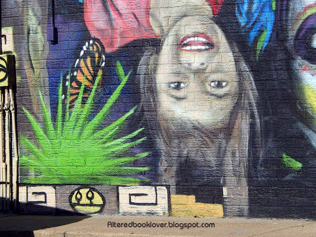
 This summer I was a passenger when we drove by and I spotted the new mural. It was obvious the son had lost the petition. Needless to say, the photo left something to be desired.
  Fast forward to about three weeks ago when I was at the post office and remembered I wasn't too far from this mural. I took several close-ups.
 I never found who painted this new mural, but I personally preferred the previous one. It's located at 29th St. North and Arkansas (it's pronounced Ar CANS ass, not ARK an saw) in Wichita, Kansas, USA.
If you enjoy murals, please don't forget to visit Monday Murals at Sami's Colourful World.


.JPG)


23 thoughtful remarks:
The new mural is good, but I liked the first one better, it just seemed so much brighter and glowing. Have a nice day, Valerie
Some fabulous artwork here, love the brightness of the murals.xx
The first mural was fabulous, the second is too.. they are both along the same idea of the Mexican 'Day of the Dead' celebration. Hope you had a super Christmas Elizabeth and all the best for an excellent year ahead 💙
Now this is really difficult.
Especially with the message it brings.
The first one to me expresses the celebration part quite good (sometimes I wish we could honour our passed ones like that).
The second is much more arty, wonderfully done. I especially like the child, she grows up not being afraid of death.
My Brother takes his Daughters to our parents grave regularly. They know "Omi and Opi" "live in heaven. A nice thought.
Wow, there's no doubt that the new mural has some astoundingly good painting in it - evocative images, powerful and very expressive - but I confess I rather miss those cheeky cheery skeletons. (With my love of all things muted and vintage, I actually prefer the slightly faded look they had after a few years!) Still, they're both really impressive pieces of outdoor art, commemorating one of the only two inevitable parts of life.
Alison x
They are both beautiful but I'm with you. The first one is more fun and has happier colors. Those skeletons are having a good time. The new one has a goth feel or like items you might see in tattoos. But both artists are very talented and it is hard to compare different styles except by personal taste. Hope you're having a great weekend. hugs-Erika
Oh, did you get the dyeing article I emailed you?
I like them both. And perhaps, the sugar skull in the new mural is an homage to the Day of the Dead festival from the first.
...I like both of them, but I'm not a fan of painting over a mural. Understandability you were in a colorful part and so was I this week!
What a shame the original mural couldn't have been repaired and preserved. The second one is fine, but that first one had a more unified nature to it and more life imo.
Collecting murals is frustrating because they are fragile and vulnerable to a variety of dangers. They fade or they are over-painted with (often terrible) graffiti, or the building is torn down or replaced or hidden by another building. Maybe we just need to get used to the idea that they don't last the way that museum art lasts. Maybe that's part of the appeal. Still always sad.
best... mae at maefood.blogspot.com
Those murals are wonderful, I love the happy colours on them, and the way the artists created them.
I wish you a very nice Sunday, and send big hugs,
Caty
Both murals look good, but I also think the original looked better. There looked to be more movement and colour in the first, the second one a bit on the somber side for me.
Yvonne xx
Too bad, the son lost!!!!
What a pity they didn't fix up the old mural, when new it was quite pretty and bright. I do prefer the first mural too Elizabeth, although the second mural is very artistic.
Thanks for contributing.
You have murals and murals but in this case I think the old one and the new one are in balance. Also a mural is mostly a temporary thing and doomed to dissappear in a couple of years.
The first mural is fun and bright feeling, and the second one is impactful. But both so detailed and absorbing to look at. I'd prefer looking at the first one if I had to drive by regularly I think
The new mural is compelling but I think I prefer the first one more -- I love the colors and feeling of it. This one seems a little heavy!
Great ones, both. Nice to see that they kept the theme going. :)
Have a lovely week. :)
The second one is nice but I'm partial to the first one!
The first one looks nicer from a distance. I find the second one compelling with all the portraits.
I prefer the first mural as well. It s fun and inviting where this one is scary and that upside down kid looks possessed. Sorry, I prefer ar-kan-saw. :)
Oooh! I much prefer the first one! Much more fun! Chrisx
Post a Comment