I apologize that I have not had time to create a tutorial this month. I have two I have researched, to see if they were feasible, but both require I be in the basement studio to create them. Since it isn't ready yet, and since we had another nearly 9 inches of rain over the weekend, I wasn't about to try to make art down there. Also, it's so hot in my main floor craft room, I can't stay there long, especially since the fan I use in the craft room is still removing excess moisture in the basement.
There are lots of new readers since I posted this tutorial in 2008, and since it's one of my favorite backgrounds, I thought I would post it again. Be aware, my camera back then was definitely not the best, or even very good.
I call this "making a background from ugly scrapbook paper." Of course, you can just as easily use this technique when starting with a blank page.
I usually make my own backgrounds, and love the grunge look. However, I've never seen a tutorial on how to take a sheet of ugly scrapbook paper and turn it into something that can be used in altered art. That's what lead to this tutorial. I was just playing, pulling out my supplies, and adding layers until I got a page I liked. No two backgrounds will ever look the same.
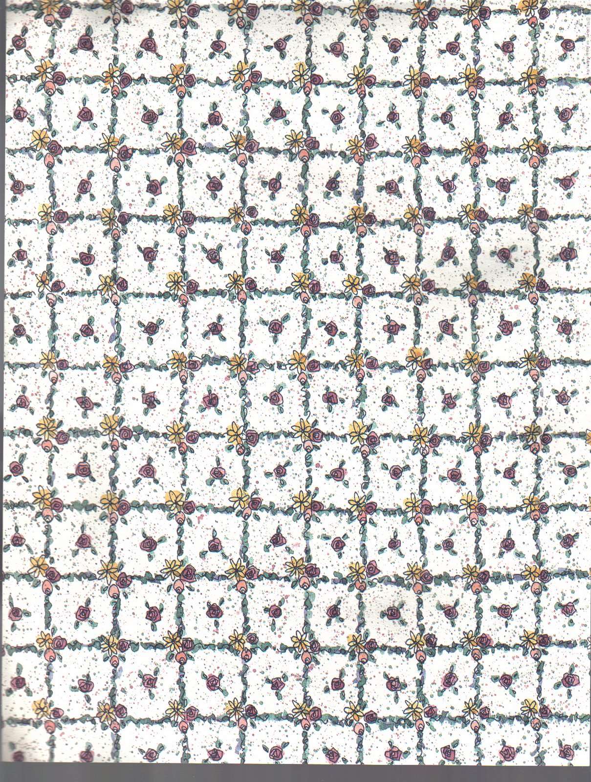 I started with this really ugly sheet of lightweight scrapbook paper,
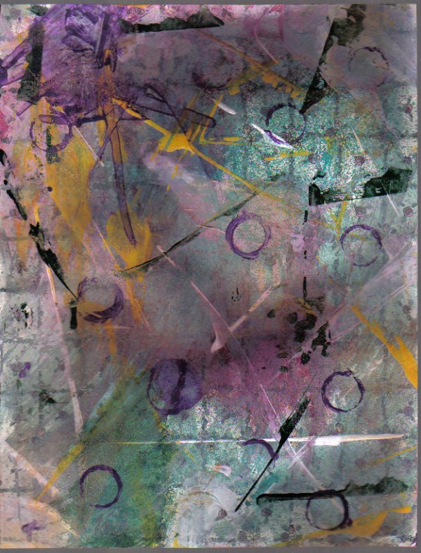 and turned it into this. The main colors in the original page were
lavender and yellow flowers, and green leaves. This is the palette I
decided to work around so some of the background could still show.
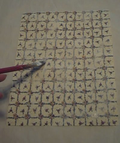 I started by placing gesso on the page. I didn't try to cover the
entire image, because I wanted some of it to eventually show through the
grunge. I told you my camera sucked. I wasn't joking! That's why I'm always saying how much I love my "new" camera.
 After I had toned the paper down a bit with the gesso, I spritzed it
with green (Bottle) color wash. I then allowed the color wash to dry. If I were to create another page similar to this today, I would use some of my handmade shimmering mists, but I used what I had at the time.
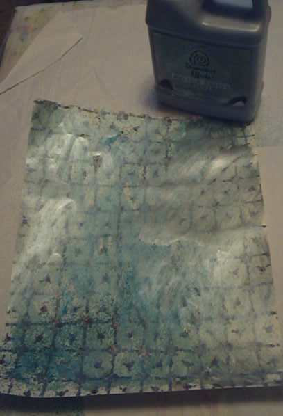 Next I added a silver glaze, covering some of the piece and leaving some of the original background intact.
 All the glazes meant to be used on walls were picked up at my local Household Hazardous Waste Swap and Shop, a county run facility that takes items you can't send to the landfill. I've said this before, I pay for this service with my property taxes, so I feel I get my money's worth. I've picked up lots of "freebies" like paint, floor cleaner, and anti-freeze (for my car). I know my friends in Europe and Australia have great recycling programs, so if your city has one, you should check it out.
 My next color was Cranberry color wash.
 I used a dry paper towel to wipe some of it away.
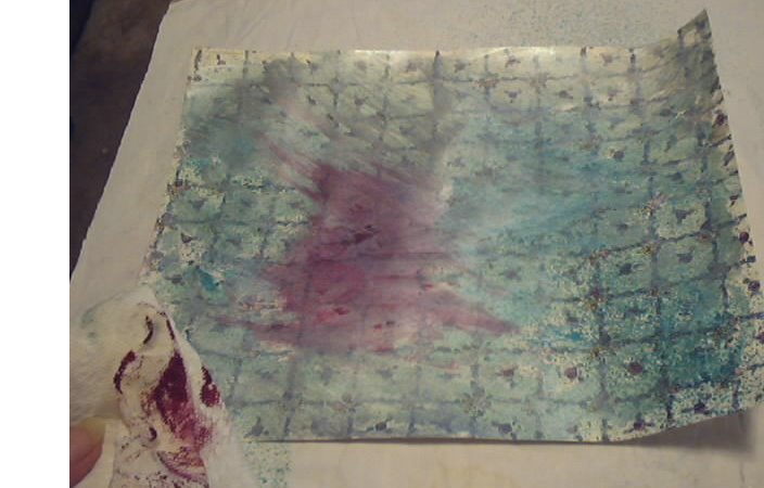 It spread into the still slightly wet silver glaze for a really nice
effect. I then repeated this step in another area of the page. Since
color wash dries quickly, you should work in one small spot, then
repeat, rather than trying to work with the entire page at the same
time.
 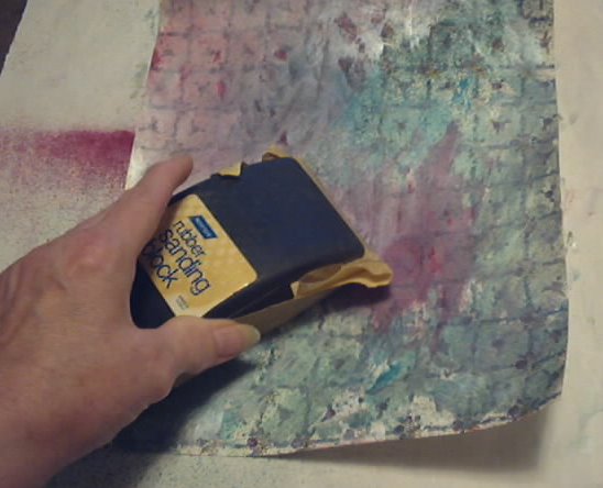 For my next step, I sanded parts of the page, being careful to not damage the thin paper.
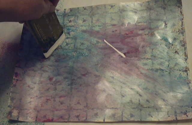 Using the edge of an old faux credit card, I added white paint. I specifically left the lines rather than spreading the paint around.
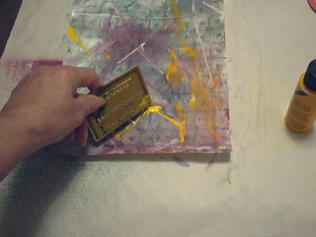 I used a different faux credit card to spread gold metallic paint around, but
this time, I didn't just create lines. Instead, I scraped a few
places.
 Next I used the same credit card without cleaning it to add a green glaze. I bought this glaze on clearance at a big box craft store in the US.
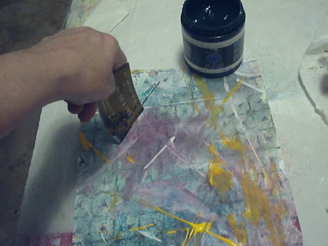 I again added just lines with the green glaze, much like I did with the white paint.
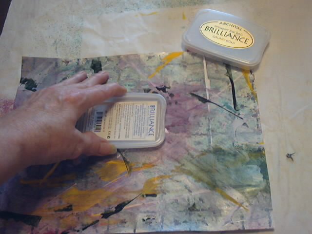 Next I swiped white pigment ink on the page, using the direct to paper
method. I poured clear embossing powder over the ink and heat set. I
did this in a few places only, and not all over.
 Although I didn't photograph this step, I added some lavender paint
using the same dirty credit card. And finally, I dipped a bottle cap in
the same lavender paint and created the circles. From ugly to grungy,
and now I have a background I will use in my art.
Although I didn't photograph this step, I added some lavender paint
using the same dirty credit card. And finally, I dipped a bottle cap in
the same lavender paint and created the circles. From ugly to grungy,
and now I have a background I will use in my art.And use it I did, although I can't find the post that shows where I used it. Of course, my favorite grunge page starts with plain white paper and fewer steps.
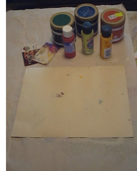 Supplies are simple:
12 X 12 sheet of scrapbook paper, or any substrate of your choosing
Various paints and glazes of your choice
Gift, old faux credit, or hotel key cards (be sure they are plastic because the paper ones don't hold up well)
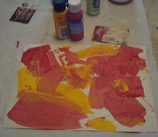 Begin by spreading two complimentary colors of acrylic paint on the page
using your faux credit card. Note that I used inexpensive acrylic. You don't
need the good stuff here, because much of it will be covered anyway. I
chose red and yellow because I love that warm color combination.
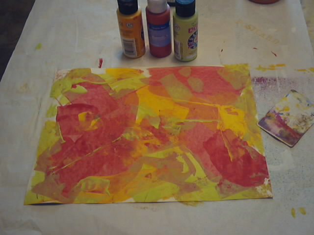 To that, I added lime green, covering some of both the red and the yellow. This helped create even more color and depth.
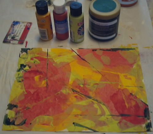 Next, I dipped another faux credit card in dark green glaze and using only
the edge, swiped lines into the center. I then filled in the remaining
empty spots on the page using the same glaze.
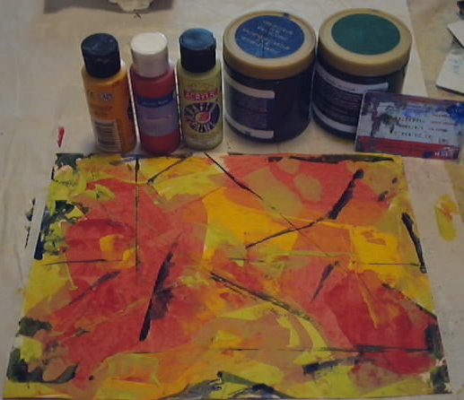 I repeated the above step using dark blue glaze.
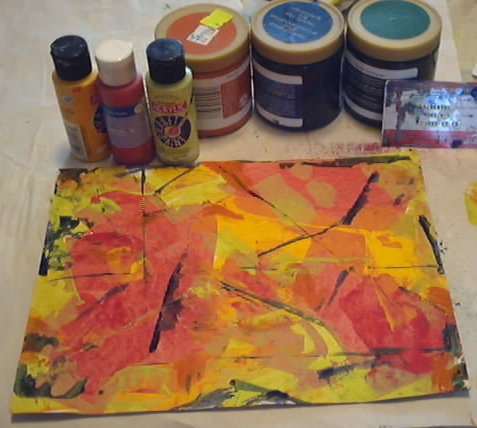 Then I swiped orange glaze in select areas using a clean faux credit card.
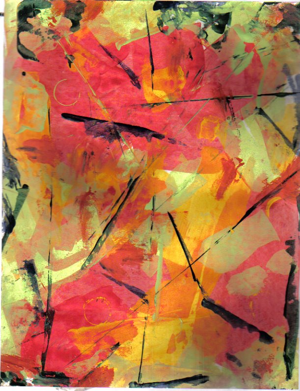 Here is the completed piece. If someone had told me that red, yellow,
and lime green paint, along with deep green, royal blue, and orange glazes went well
together from a color standpoint, I would have shaken my head in
disbelief. But, since I tried them all together, I really like the
results. Hope this inspires you to create your own grunge background.
Here is the completed piece. If someone had told me that red, yellow,
and lime green paint, along with deep green, royal blue, and orange glazes went well
together from a color standpoint, I would have shaken my head in
disbelief. But, since I tried them all together, I really like the
results. Hope this inspires you to create your own grunge background.Note that I added no texture, other than embossing powder to the first page. Since I first created these pages (after all, it WAS 2008), I have acquired a few stencils, bubble wrap, punchinella (sequin waste), and masks that can add depth and perceived texture.
I hope some of you enjoyed this reposted tutorial. I am going to try to get a post later in the month that will take the place of August's second Thursday tutorial. In the meantime, thanks for looking. I'm really glad you dropped by!


.JPG)








14 thoughtful remarks:
loving the backgrounds, especially the red and yellow one. hope you get to go back in your basement to work soon.
You made some lovely backgrounds, and it's always good to be able to use up old scrapbook paper. Sorry your weather conditions are still causing you problems. This has been a crazy summer so far here, too.Have a fun day, Hugs, Valerie
Such fantastic ideas. I am beginning to wish I hadn't given all my patterned papers away now lol. I am sure there will be some lurking somewhere if I look. Thank you for the tutorial
Love Chrissie xx
Love Chrissie xx
When you show background papers you have created I'm always struck with what a good idea it is to make some and have them on hand. Maybe someday I will actually do that, LOL. Like both pages.
Rain inundating your basement again! That's terrible, hope it dries up soon.
We've also had a lot more rain than usual but nothing drastic has happened yet, thankfully!
I like your colourful papers.
Have a lovely weekend Elizabeth.
These are as nice, if not better than gelli prints. Love all the layering and using up ugly scrap booking paper. I have a stack set aside just to do such things. And maybe next time I won't pull out the gelli plate. It just paint layers. I hope you didn't flood again either. We are in a drought and you are getting so much rain. What a summer. Hugs erika
Great backgrounds -- and a good way to get rid of the boring scrapbooking paper. i like them both. As someone commented, a great rainy day project.
Its a great tutorial Elizabeth, the results look wonderful and will be so useful to have to hand. I smiled when I saw the photo using a swipe of and ink pad and the edge of a credit type card. I was just playing with colours that way the other day.
Yvonne xx
Just love these two backgrounds and all the layering; can't make up my mind which one I like best! Not more rain - is it still getting into your basement, or are you waiting for it to just dry out? I know how frustrating it is not to be able to do what you want due to adverse weather conditions. :oD
Your workshop tutorials are always such a great inspiration! The papers turned out fabulous! Mixed Media backgrounds on the highest level!
Super!
Your lavender, yellow and green background looks like a wonderful abstract piece of art to me. It would be hard to use as a background me thinks!
You did great stopping along the way to snap photos E.
Thank you for sharing some of your creative process.
You do that so well.
Happy Weekend.
oxo
I love your backgrounds and loved seeing the process to make them! I have used a similar way in the past to deal with an excess of some horrible Christmas paper! Hugs, Chrisx
these backgrounds turned out splendidly...love this re-post. hope things cool down for you soon and your basement gets finished quickly! ♥
I saw this earlier, when I was dashing out, and was fascinated by it, as I am again now. Imagine using scrapbook paper like this and changing it so completely - what a great idea! And the next time someone gives me a pile of not very nice papers I'll keep them instead of passing them on. I'm super-impressed with the lines you make with the credit cards, they give the designs that extra oomph.
I thought at first I much preferred the first but now I like the second best, although I still like the first too.
Thanks for another great tutorial with all the clear photographs and instructions.
Post a Comment