I want to begin by saying I tried to make it around to everyone, but time was not on my side this week. With a holiday, out of town visitors, trips to the airport, and a massive clean-up in my yard, I was off the computer more than on it this past week. For that I apologize. Now lets get on with the SOC colors of the week.
I couldn't believe it. This was the color combination I not only wanted, but a slight variation of it was what I suggested to
Kristin, our wonderful hostess at
Twinkle, Twinkle, before SOC3 began. I had a plan. I knew exactly what I wanted to make. Then I thought about the NAME of the colors, and a competing thought came into view. So that was when I knew I had to make two entries for this challenge.
For my first page, my supplies include (from left):
Clear acrylic block (you can substitute glass, but you must cover or tape off the edges first)
White card stock
Yellow card stock
Plate for holding paint
Brayer
Red and Yellow fluid acrylics
Allow me to explain this photo. The white card stock is located BELOW the acrylic plate which is rather hard to see in this photo. The card stock will help me guide the top card stock so I don't get too far off course. And I know this red paint doesn't look red, but I assure you, it is red, and not on the pink side of red, either. This camera must have a thing for twisting colors around while giving me really unclear shots, too.
I laid a stencil upside down on my acrylic plate and got a good load on my brayer.
But I've mentioned before that I am brayer challenged, and even this new brayer doesn't work well in this situation. Instead, I ended up "stenciling" the paint onto the acrylic block using a paint brush.
I removed the stencil and laid my yellow card stock on the inked plate.
As I began removing the paper from the plate, I got this sinking feeling that the paint had dried on the plate and now the paper was stuck to it. If you look closely at the acrylic plate, you can see bits of yellow "fuzz." Then it was time to clean the mess I had made. And my disappointment was beginning to show.
After cleaning for what seemed like hours, I finally got the paint off the brayer and the acrylic block which was drying in my kitchen when I took this photo. A closer look reveals I have outlined each letter using a red ink pen. Although not originally planned, I will sew this page to the other one I intend to make. This will be the "back" side, which leaves room for punching holes on the right side of the card stock above. My disappointment has now lifted.
Next, I got out a rubber stamp and my Staz-on reinkers, since I didn't have the requisite ink I needed for this stamp.
And although you can't see it very well, I used the glittery Stickles on the side of the Candy Apple. BTW, I told you that paint was red. I am sure you believe me, now. I call this piece "Apple for the Teacher."
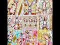
My other piece began with what I think of when I think of red and yellow. Although it looks more like pink and gold, it is really red and yellow I'm getting ready to spread around the white card stock using a plastic gift card.
I love how this simple technique makes such an amazing background.
Same red as before, this time paired with bright yellow on white card stock. Lots of Asian influenced imagery.
I admit, when I had finished this piece, it felt not quite finished, so before I scanned it, I added the bit of joss paper in the lower left corner of the page. When I scanned it, I felt it was now out of balance.
So I revised the piece by painting over the offensive joss paper. Although you can still see a bit of it, at least, in my opinion, it's not quite so offensive. Which version do you prefer?
Don't forget to visit
Kristin for the links to all the other players this week. I know they appreciate your visit as much as I do.


.jpeg)


.JPG)


50 thoughtful remarks:
I can't believe you got this loaded so fast. :) You are a machine!
I love both the images. Love the idea behind the first one, and I love how completely different the Asian one is. I think I prefer the joss paper pushed into the background in the bottom one.
So much fabulousness here and these colours feel very summery this week, though I have no idea what I am going to do at the moment!! :)
Super Asian page, love it. I knew the colours upfront too but yet again not my choice so inspiration wavered. However your Asian piece has given me some ideas. Thanks BJ
You do these so quickly! Two very different images and both very fitting for the colours.
So do you have a direct line to Kristin, or what!
These are great! You should stamp more often, that apple is perfect.
And the Asian piece knocks me out. So bright! I like the painted joss paper better and the pop of green just makes this.
Fantastic combos. I am brayer challenged too and I really like the way your lettering came out. Wabi sabi rules the day....xox
I'm sooooo happy your colors finally got picked!!! Isn't it great to play with your favorites, you feel inspired right from the start!!
Guess what? haha these are not the colors I would pick. So this week has me stumped already. Funny your first piece is about school, I wrote this in my comment on SOC before even coming here.
LOVE the apple and the letters, SO COOL!! Glad you made it work out ok.
The second piece is gorgeous, love seeing the process of the page. I like it both ways really. The pop of green is awesome on here, might have to remember that for when I start my cards.
So happy again for you, way to go on being the first link up again. I love that your ready to go each week.
Thanks for the comment on my cards this week, especially since you were busy. I might just try to paint this week and get messy like you did. Wish me luck!
Fabulous pieces, Elizabeth! As soon as I saw the color choices for this week, my mind went to Asian. So, I'm sure that's what I will be doing, in some way.
Thanks for sharing your processes with us - I may have to get out my gelli plate for this week! The paint doesn't dry as quickly when using it.
Wonderful pieces both, love the fresh simplicity of the first one and the oriental richness of the second! Great job with the colors! <3
Both works I like very much, dear Elizabeth! The idea with the Far Eastern symbolism is great. Beautiful!
Love both of these, so creative. Really love the Asian theme - so perfect for this and I'm kind of kicking myself that I didn't think of it. Beautiful.
Ohh finally, you are playing with colors you love!!!. I LOVE the wonderful oops there, how nice to have a ethereal alphabets like that!. LOVE the first art, LOVING the second even more. So happy, bright and oriental!
LOVE both entries!!! They are perfect. I currently have paint drying but will hopefully get mine posted later today. That Holiday week was crazy busy!!
Love, love love the "apple for the teacher"... Couldn't see where it was going at first then "taaaaaaaadaaaaa" great aRt.... :)
great make on the colors! fab!
Sorry, I've been a little slow to get around this week, but I am here to catch up now!
Hope you have luck with your new Lavender plant. I've tried 3 times to grow cucumbers this year--they just refuse with the crazy weather we have been having. Your patio does look nice after the poorly timed plastic break-down.
Very nice of Sandee to send you her "old" camera. I hope it works well for you.
I love both of these pieces--as for the Asian-inspired one, I like the second version better.
I like them both BUT if you twisted my arm and made me choose i would pick the one WITH the piece in the corner....looks more...i don't know finished...Hugs! deb
your letters are great... love the look of them.. slightly out of focus... perfect!
Beautiful work Elizabeth- love the letters piece and your other piece is eye-popping inspiration- wow!
it looks as though you had so much fun. such a wonderful apple.
xo :)
Your work is great. Looks like it was a lot of fun. Love the colors.
Well I like them both and I like the apple for teacher as well, I think that one is my fave!
Thank you so much for your sweet comment on my blog! See you next week !xo
Fabulous stuff - I found the colours this week hard work but I'm getting there!
Great work, great colors. The apple is perfect. I like the Asian one best WITH the piece you painted out - but I like it without as well.
Darla
very nice work you did this week for the Summer of Colors challenge! Thanks for stopping by my blog as well! :)
After all your problems the apple and letters page turned out so well. And I love the asian influenced piece. Can't pick a favourite, I love them both. Interesting to see the process, and you put so much into your work. I'm a great admirer.
Your apple for teacher piece is sweet and I love the colors and Asian feel of your second piece. Good work!
Very nice piece of art and an amazing tutorial.
I liked it with the paper in the corner, but maybe just because I liked that paper--LOL!
You know what will clean that hardened old acrylic paint off? Rubbing alcohol! I am much happier since I discovered this miracle cleaner of crusty paint! :):)
You know? Something of a Chinese/Asian nature came to my mind too, but moreso, I kept seeing Ronald McDonald, or a circus tent! (ugh!).. Love your work anyways! ~tina
So glad you got to have such fun with colors you were excited about! I haven't quite gotten there, but there's still time... I just love the sweet simplicity of your first piece, I just love the apple and it all works so well together. The Asian one is the perfect idea for this color combo, it seems so obvious now that I see it - I keep scrolling up and down and can't decide which version I like best!
Hello, I wanted to let you know my SOC post is up. Your apple inspired me for one of my pages this week. I'm hoping to do more with these colors in the future but had to stop today as the rest of the week is very busy for me.
Turns out I LOOOOVE these colors now and has SO MUCH FUN with them. Glad again that your colors got picked this week. Now I wonder what colors will be for our last week. It's been so nice getting to know you, thanks for your visit and for your inspiration each week.
I love your bright bold colors.
What a simple but effective idea! I just love that apple :)
Love the piece with the apple and for the second one if I had to choose, probably the one with the piece in the corner.
xx
Thanks for taking me along on your creative journey - I always enjoy seeing the process behind the creation :-) I really like the finished result with its oriental influence and vibrant colours. As to which version I prefer........I kept looking between the two and......sorry I'm no help cause I can't decide, lol :-)
Hope all is good with you.
Kat :-)
Two wonderful creative pieces...love what you did with this colour combo :)
These are great pieces and I especially love the apple for teacher!
How funny that the colour was so different .... spooky camera!
Beautiful work! I especially like the Asian imagery. Have a great day! - janice (visiting from Creative Every Day)
Very nice, love the Oriental piece, perfect for this color theme! Stop by when you can, I finally got my post up for this week! Happy SOC!
I have no clue what to do for these colours. All that keeps popping in my head is Snow White's apple with the dripping skull. Maybe I should just go with it.
I love both your pieces but especially the apple. And as for the second - yes - the one where the paper is pushed back but both are gorgeous and wow those colours pop and zing.
Ah! Not only do I love your "Asian influence" with these colors, but your process is enlightening! Thanks for sharing this, and for the Candy Apple Red & Yellow suggestion!
Oh, what beautiful pieces! I really enjoyed seeing the stages along the way, too.
LOVE the Asian inspired piece - either version! I had a hard time with the red & yellow to begin with because all it reminded me of was McDonalds (yuck).
Both fabulous! Well done!
Looks like you had fun with this one. I love the asian inspiration and I love reading (and seeing) your thought process.
Looks like you had fun with this one. I love the asian inspiration and I love reading (and seeing) your thought process.
Such an awesome project using this week's SOC colors! Thank you for showing us how you did it, too!!!
wonderful collage and how bright your red and yellow are.
Wishing you a lovely week
Both are fantastic! Thanks for sharing your techniques!
Post a Comment