I was going to meet Halle on June 3, so I wanted to make a birthday book (belated as it is) for her, too. This book took much longer. I began working on it the Tuesday before Memorial Day and didn't finish it till the Thursday after Memorial Day. The reason is it is a very personal book about what I know about Halle and what each letter of the alphabet reminds me of her and her family.
 This is the book that I'm giving to her. I put it in a tin box that I "painted" using alcohol inks.
 Here is the completed book showing the front cover, the ribbons, and rings I used in its assembly.
 The front and back covers. As I state later in the text, I learned my lesson on Ruthie's book. Both the front and back covers should match.
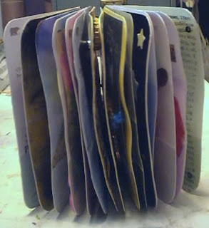 Here is a close-up of the book standing after it is complete.
 And this is another view of the completed book.
 This is the outside and inside front cover. The holly is from my garden and is a play on Halle's signature where she writes "Halle, pronounced Holly." I thought this was the perfect thing to introduce the book to the viewer. The outside page was covered with holly tissue and "ABC" stickers I toned down using beige glaze.
 Since each page is back to back, I scanned the A and Z pages together. You can't think of Halle and not think of Autism, a disorder one of her children suffers from. It is a part of her life and she is an active spokesperson in her community for this disorder. The puzzle pieces are part of the Autism logo. I began by gessoing each piece, then tried to paint the pieces. They didn't paint well with cheap acrylics, so I got out my oil pastels and went to town. They turned out much better than when I tried to paint them.
Z is for Zoo. I'm not sure if Halle and her family go to the Zoo, but I figured they probably will some day. The strips of animals are wallpaper chip samples I got several years ago. I don't think they give them out anymore.
 B is for boy. Halle works closely with children, especially those in her children's school. I could have turned this into a C word (child), but I wanted C to be coffee, since she plans to make a coffee book in the near future. The boy is a transfer and the 7 is a brad. The 7 denotes the age of one of her children, who unfortunately has now turned 8. I first used stencils on the page, but they disappeared into the transfer medium. I eventually got out my staz-on and stamped the letters. As you can see, I don't stamp very well, especially when the stamps aren't clear and I can't see where they will "land."
 B is for boy. Halle works closely with children, especially those in her children's school. I could have turned this into a C word (child), but I wanted C to be coffee, since she plans to make a coffee book in the near future. The boy is a transfer and the 7 is a brad. The 7 denotes the age of one of her children, who unfortunately has now turned 8. I first used stencils on the page, but they disappeared into the transfer medium. I eventually got out my staz-on and stamped the letters. As you can see, I don't stamp very well, especially when the stamps aren't clear and I can't see where they will "land."
 Coffee just had to be the C word. However, where's the coffee? The cup is totally empty!! Maybe Halle or her hubby has already drank it.
 Halle and I have talked about the rising cost of health care, insurance, and rising gasoline costs that cut into many middle class budgets. When I saw the word "deficit," I thought of the struggles she, her family, and many like her face each day and the way their lifestyle is being eroded due to a deficit in their paychecks.
 Halle and I have talked about the rising cost of health care, insurance, and rising gasoline costs that cut into many middle class budgets. When I saw the word "deficit," I thought of the struggles she, her family, and many like her face each day and the way their lifestyle is being eroded due to a deficit in their paychecks.
Halle gets eggs from a neighbor and even decorated some this last Easter. What could be better than foam eggs and letters to represent "E?"
 "F" could have stood for many things, but I found this awesome flower image and couldn't pass it up. I also had to stamp the flourish, since she also loves to add these to her pages. The "F" was stenciled on the page. You can see how the paint chip sucks up the ink.
 "F" could have stood for many things, but I found this awesome flower image and couldn't pass it up. I also had to stamp the flourish, since she also loves to add these to her pages. The "F" was stenciled on the page. You can see how the paint chip sucks up the ink.
"G" is for grad, something her youngest just did. I thought it was appropriate, since Halle will face many more graduations in the future, due to the new fad of graduating children at many levels, rather than waiting till they get through high school. For this spread, I used a napkin that I added star brads to. Home is very important to Halle, and I love making houses. I couldn't pass up the opportunity when I found some text about Minneapolis/St. Paul. The wire circle was something I practiced when I learned how to make a decent circle. Two of the houses are left over from my anniversary squares. The "H" was stenciled using a watercolor marker, while "ome" was stenciled using a zig pen. The zig pen didn't soak into the paint chip as much.
 Home is very important to Halle, and I love making houses. I couldn't pass up the opportunity when I found some text about Minneapolis/St. Paul. The wire circle was something I practiced when I learned how to make a decent circle. Two of the houses are left over from my anniversary squares. The "H" was stenciled using a watercolor marker, while "ome" was stenciled using a zig pen. The zig pen didn't soak into the paint chip as much.
I always get inspiration and artistic ideas from Halle, so had to include this cool image.
 The "J" is so Halle can add photos of her children. Due to my perverse desire for internet security, Halle will have to add their names and photos.
 "K" is for Halle's husband, who is a real prince. I used a large playing card, then added a mica chip over it. I attached the mica with brads, one of which was a heart.  I already had the "W" spread finished when I found this wonderful napkin filled with wine labels. So, instead of chucking the wine idea, I used the spread for "labels."
 I already had the "W" spread finished when I found this wonderful napkin filled with wine labels. So, instead of chucking the wine idea, I used the spread for "labels."
 This is a magazine image of Minneapolis at sunset. I thought it was perfect for this book, even though I didn't get it smoothed out too well. The "M" is a sticker enclosed in a used bottle cap.
 Halle has a huge connection with her neighborhood, so I turned a neighborhood into a square around a courtyard in which her new chiminea is the center. I actually had the idea and the image before she bought her chiminea. Yep, I drew the chiminea, something I struggled with. Instead of messing up the paint chip, I drew it on another, smaller paint chip and attached it to the page.
 Halle has a huge connection with her neighborhood, so I turned a neighborhood into a square around a courtyard in which her new chiminea is the center. I actually had the idea and the image before she bought her chiminea. Yep, I drew the chiminea, something I struggled with. Instead of messing up the paint chip, I drew it on another, smaller paint chip and attached it to the page.
 "O" is for openhearted. I knew I wanted to use the locket, but didn't know what word would go with it. Halle can remove the locket if she chooses, because I stenciled an "O" underneath it. And, YES, I feel that describes her to a T (or is that an O?).
 You can't think of Halle and not think of "Postage People." I had never heard of this trend until Halle started making them. I'm not as good at it as she is, but it was fun trying to find something. This will probably be the only one I'll ever make, but it's definitely in homage to her.
 You can't think of Halle and not think of "Postage People." I had never heard of this trend until Halle started making them. I'm not as good at it as she is, but it was fun trying to find something. This will probably be the only one I'll ever make, but it's definitely in homage to her.
 "Q" is for Queen Halle. It matches the King spread, right down to the mica and the one red heart.
 Halle's hubby repairs things. So, when I saw these circuit boards in a state of disrepair, I just had to dedicate this page to him.
 Halle's hubby repairs things. So, when I saw these circuit boards in a state of disrepair, I just had to dedicate this page to him.
"Stars" is for her children. The sparkling ones are glow-in-the-dark stick-ons. The background is a page from an astrology textbook. I found this map of the "Twin Cities" and turned it into a tape transfer. I layered it over a pop-art statue that is outside the Minneapolis Art Museum.
 I found this map of the "Twin Cities" and turned it into a tape transfer. I layered it over a pop-art statue that is outside the Minneapolis Art Museum.
 Halle saves fuel by riding a bicycle with her children. However, I thought this image and dictionary description were funnier than a bicycle. It also gave me a spread (that was comical, too) for the letter "U."
 I found this Disney paint chip in with the others I have collected and immediately thought "Vacation." I tumbled the sea glass, which I think looks a bit like the letter "V."
 I found this Disney paint chip in with the others I have collected and immediately thought "Vacation." I tumbled the sea glass, which I think looks a bit like the letter "V."
Wings are probably going out of phase in the art world, since they have been overused so much in altered art. However, my friend Theresa sent me some polyclay "rejects" with the word "wings," so I decided to use one in a spread. While I was outside watering my garden, these whirly-gig seeds came down in my driveway. The idea was born to turn them into wings. I first covered them with embossing fluid, then copper embossing powder to match the copper in the polyclay piece. Then I found an image that I thought wings would go with. Maybe wings are out of favor, but I had to make one last spread using them!!
 X was the one letter I really struggled and struggled with. I thought about an X-ray, but didn't want to bring up any painful memories if one or more of her children had something broken. I have no idea if Halle has any musical interests or not, but I thought this would be the best choice. I swear, it was probably out of frustration that I settled on this image, because this was the last one I made. I used clear embossing powder (ep) on this, and left my heat gun too long and scorched the image. Yep, that's the brown part on the page. However, the white part of the paint chips took the ink differently than the colored parts, so they also took more ep. I learn something every time I do an art project, and this was a very valuable lesson.
 X was the one letter I really struggled and struggled with. I thought about an X-ray, but didn't want to bring up any painful memories if one or more of her children had something broken. I have no idea if Halle has any musical interests or not, but I thought this would be the best choice. I swear, it was probably out of frustration that I settled on this image, because this was the last one I made. I used clear embossing powder (ep) on this, and left my heat gun too long and scorched the image. Yep, that's the brown part on the page. However, the white part of the paint chips took the ink differently than the colored parts, so they also took more ep. I learn something every time I do an art project, and this was a very valuable lesson.
When I think of Halle, I think of true love. I thought of when she first met her soon-to-be husband and the young love they must have shared. Thus, this spread was born around a valentine ATC I made this year. The hearts were cut from a napkin, then outlined with gold leafing pen. Outlining was hard, since the napkin was so thin and wimpy.
 This is the back outside and inside covers. The outside is the same as the front cover. I learned from Ruthie's book that continuity makes for a better book cover. The inside began with a stamped image from River City Rubber, then another image on a transparency that Theresa sent me. I believe it is from Stampin Up. I attached it using eyelets.
I'm really excited for Halle to get this book. We won't have time to go over how I made the pages, or my rationale for each letter. That's why I spent so much time documenting my thought process. Hopefully, by the time she reads this, we will have met and had a good laugh or two. Update: Due to an unforseen illness, Halle and I were unable to meet, so I had to mail this to her. She called me today, June 21, nearly a month after I started it, and told me she received it.


.JPG)









1 thoughtful remarks:
Absolutely touching memento for your friend Halle ... she must be very special to you as you must also be to her. Thank you for the inspiration for me to be a special friend as well.
~M
Post a Comment