


.jpeg)


.JPG)


I'm not complaining, but everything has gone wrong with these tip-ins. I have spent hundreds and hundreds of hours on them and I HATE THEM. But, the first one is finished and I'll share it with everyone and explain my techniques.
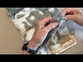
 This is the back side before any embellishments. I began by swiping green metallic paint across the width of the page using a faux credit card. After the paint was dry, I swiped again, this time using Elmers white glue. When that was dry, I added the final layer, which was blue glaze, again swiped with a faux credit card. The gable or roof was made using wallpaper, which I promptly ran out of before the project was complete, so I had to go to Plan B and use some darker wallpaper on a few. The trim between the house and the gable/roof is silver metal heating tape, the kind you get in the plumbing/heating department of your local hardware store. I first cut them to length, then cut them lengthwise in 1/2" strips. I added the door using contact paper. The door knob and hinges were put in using a Krylon gold leafing pen.
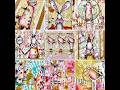
 This is an example of a completed front. This design has changed and changed over time. I began by layering sheet music over the CS, then adding the roof, which I cut from some pieces I sewed together last year at Kat's. All was well and good until I started assembling the pieces I had made for the front. Originally, the two "windows" made from slide holders (see below) were to go just under the rick-rack, but there was a size problem. They were too big for that space and I wouldn't have been able to put the "address" on the front. The tip-in was too small to get everything on.
Why, you ask did I not just put a different "address" on the page and stick with the original plan? Because I spent over three days altering these tickets to get the weathered look I was going for. I was not about to abandon them now. They were the best part of the house, except for the fabric roof. The number was left over from some confetti die cuts I bought in a package in 1999 to celebrate the millennium.
As I was adding the rick-rack, I noticed I didn't have enough of it, although it was a never-opened package. So, the tip-ins with the darker roof on the back got beige and gold trim. What can I say? More things going wrong, since this trim worked color-wise, but it was all bunched up and hard to straighten when I tried to glue it down.
The door was stamped on my handmade paper and cut out. It wasn't the right size for the "window" made from a slide negative either, but I didn't have another alternative, so at this point, I began looking for alternatives and the right layout. Remember, composition is my weakest area.
Diane Barton was sharing some images on her site (see her link under freebies until Dec. 26, 2007), so I found a mother and two children that I thought I'd like to use. The thing was, I didn't want to cover up the music anymore than I had to. I solved that by making transparency transfers. Some turned out great, some not so great, some pretty lousy. Although I printed them in black, they had a pink tinge to them when they came out of the printer. Not sure why, unless I'm running out of ink, but the color wasn't offensive, so I wasn't unhappy with it. I was unhappy when the people were taller than the door on the house, but at that point, they were all on the tip-ins, so I couldn't change them. If I got the transfer over too close to the middle, I had to change where I placed the man who is sitting at a desk in the negative. The negatives were bigger than I thought, and I couldn't rotate the image. Again, disappointment set in.
Next, I noticed as I was putting everything on the page that the pages were buckling like a bad dog. I tried weighing them down over night, but that didn't help either. OH WELL, I guess I'll have to live with the fact that my tip-ins are in the shape of an "S."
 This is one completed back. It is the only one I've finished, because I don't have much cut out, yet. I used the slide holders that were originally going on the front, which I had already edged with the gold leaf pen. I had some cool Oriental vellum that Theresa sent me and I thought it would be just the thing to look like window curtains. I cut everything I had, which was just enough. Then, to my horror, I noticed I still had a bunch of slide holders left and no more vellum. I forgot I needed two pieces per page, so I was half short. Again, disappointment sent in, but I had some leftover painted CS I was going to turn into ATCs. They were the right color, so I used them. At this point, I was in no mood to try to find something else.
I had already made the round window element from a used bottle cap. I punched circles from some paper I swiped with lavender, copper, and gold stamping ink. Then I added the angel, which is a confetti die cut.
The bird was so small, I broke one of the tail feathers when I glued it. I had to reapply it. Thankfully, this one is mine and I'll be more careful with the next ones I attach. The "Back door friends are the best" and "2000 Elizabeth Ln" were printed on green computer paper and are waiting to be cut out.
I'm not sure why I dislike these so much, but I feel the back is too plain, it is unimaginative, the front composition is all wrong, and did I happen to mention they are shaped like an "S?" I hope by the time I have to swap them, I'll like them a bit better. However, they will always be shaped like an "S!"


2 thoughtful remarks:
I like them...don't be so hard on yourself!
MERRY CHRISTMAS!
I'm not sure why you dislike these so much. I think they have come out very nice, I love the use of some of your elements such as the negative. Very clever indeed. I also enjoyed reading about the process. I now wish I had signed up for this tip in swap. Hopefully another will come around soon in which I can participate.
All my best-
Ingrid
Post a Comment